# Creating sample time series data

set.seed(123)

time_series_data <- ts(rnorm(100), start = c(2020, 1), frequency = 12)


# Creating a basic time series plot

plot(time_series_data, main = "Basic Time Series Plot", xlab = "Time", ylab = "Value")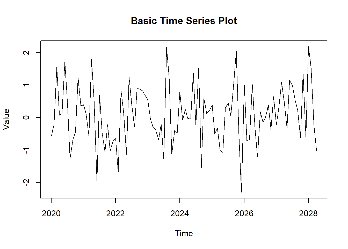
Time series plots are a powerful tool for visualizing data points collected or recorded at specific time intervals. They are essential for understanding trends, patterns, and seasonal variations in time series data. In this lecture, we will learn how to create and customize time series plots in R.
A time series plot displays data points at successive time intervals. It helps in identifying trends, seasonal patterns, and anomalies over time.
Analyzing trends over time.
Identifying seasonal patterns.
Detecting anomalies and outliers.
You can create a basic time series plot using the plot() function in base R.
# Creating sample time series data
set.seed(123)
time_series_data <- ts(rnorm(100), start = c(2020, 1), frequency = 12)
# Creating a basic time series plot
plot(time_series_data, main = "Basic Time Series Plot", xlab = "Time", ylab = "Value")
The ggplot2 package provides more flexibility and customization options for creating time series plots.
# Installing and loading ggplot2

install.packages("ggplot2")library(ggplot2)Warning: package 'ggplot2' was built under R version 4.3.3# Converting time series data to a data frame
time_series_df <- data.frame(
Time = time(time_series_data),
Value = as.numeric(time_series_data)
)
# Creating a time series plot with ggplot2
ggplot(time_series_df, aes(x = Time, y = Value)) +
geom_line() +
labs(title = "Time Series Plot with ggplot2", x = "Time", y = "Value")Don't know how to automatically pick scale for object of type <ts>. Defaulting
to continuous.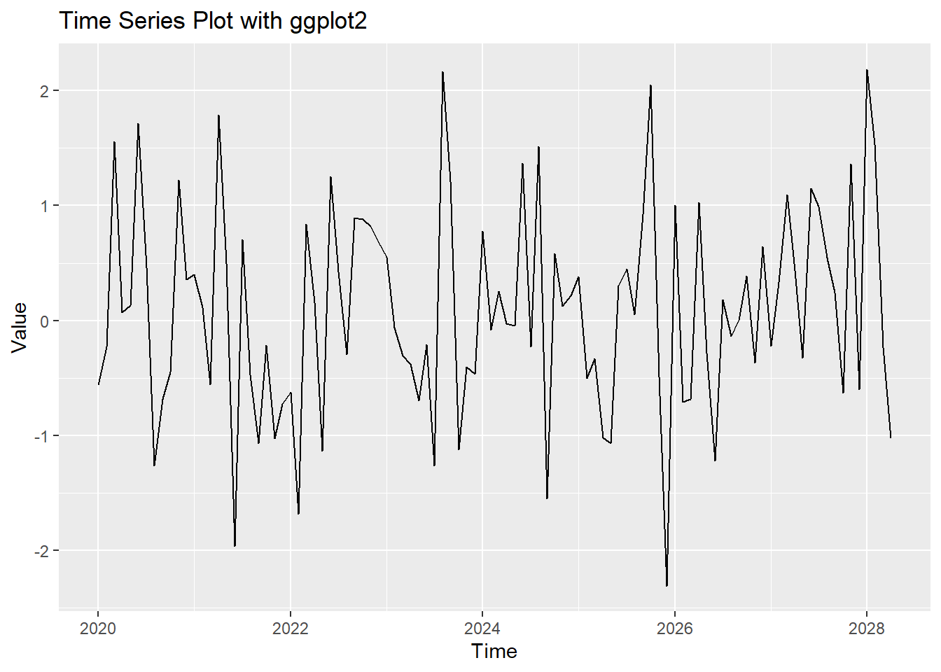
You can add trend lines to a time series plot to highlight the overall trend.
# Adding a trend line

ggplot(time_series_df, aes(x = Time, y = Value)) +

  geom_line() +

  geom_smooth(method = "loess", col = "red") +

  labs(title = "Time Series Plot with Trend Line", x = "Time", y = "Value")
# Plot result
ggplot(time_series_df, aes(x = Time, y = Value)) +
geom_line() +
geom_smooth(method = "loess", col = "red") +
labs(title = "Time Series Plot with Trend Line", x = "Time", y = "Value")Don't know how to automatically pick scale for object of type <ts>. Defaulting
to continuous.
`geom_smooth()` using formula = 'y ~ x'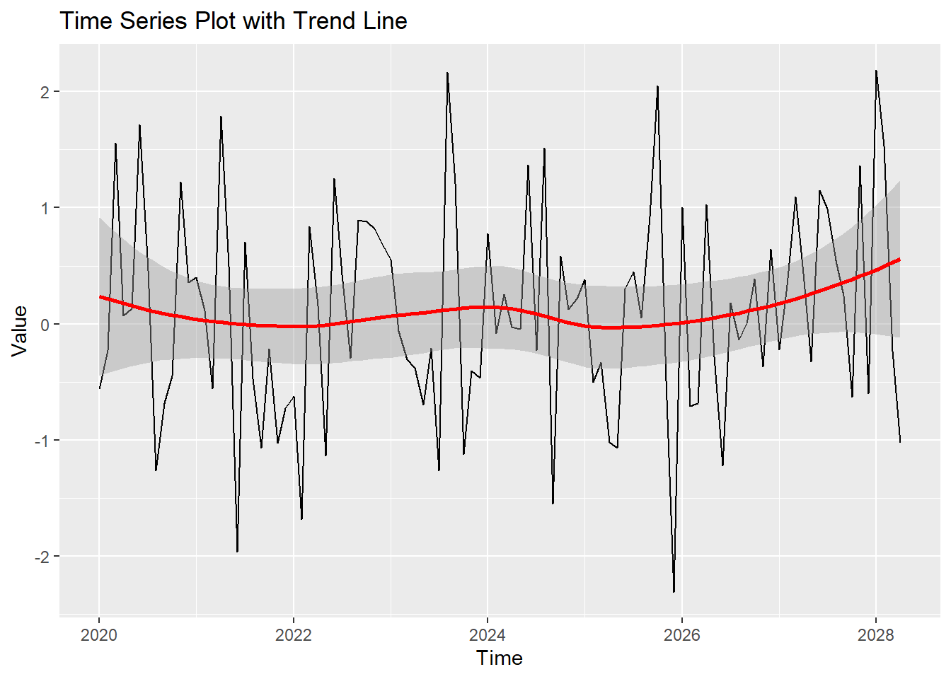
You can customize the appearance of the time series plot by adjusting colors, labels, and themes.
# Customizing the time series plot

ggplot(time_series_df, aes(x = Time, y = Value)) +

  geom_line(col = "blue") +

  geom_smooth(method = "loess", col = "red") +

  labs(title = "Customized Time Series Plot", x = "Time", y = "Value") +

  theme_minimal()
# Plot result
ggplot(time_series_df, aes(x = Time, y = Value)) +
geom_line(col = "blue") +
geom_smooth(method = "loess", col = "red") +
labs(title = "Customized Time Series Plot", x = "Time", y = "Value") +
theme_minimal()Don't know how to automatically pick scale for object of type <ts>. Defaulting
to continuous.
`geom_smooth()` using formula = 'y ~ x'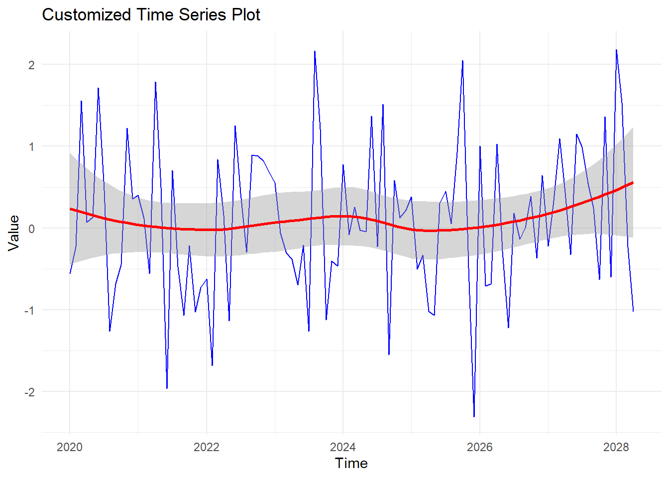
You can plot multiple time series in a single plot to compare different datasets.
# Creating sample data for multiple time series

time_series_data2 <- ts(rnorm(100, mean = 0.5), start = c(2020, 1), frequency = 12)

time_series_df2 <- data.frame(

  Time = time(time_series_data),

  Value1 = as.numeric(time_series_data),

  Value2 = as.numeric(time_series_data2)

)


# Melting the data frame for ggplot2

library(reshape2)
Warning: package 'reshape2' was built under R version 4.3.2time_series_df2_melt <- melt(time_series_df2, id.vars = "Time")
# Plotting multiple time series
ggplot(time_series_df2_melt, aes(x = Time, y = value, color = variable)) +
geom_line() +
labs(title = "Multiple Time Series Plot", x = "Time", y = "Value", color = "Series") +
theme_minimal()Don't know how to automatically pick scale for object of type <ts>. Defaulting
to continuous.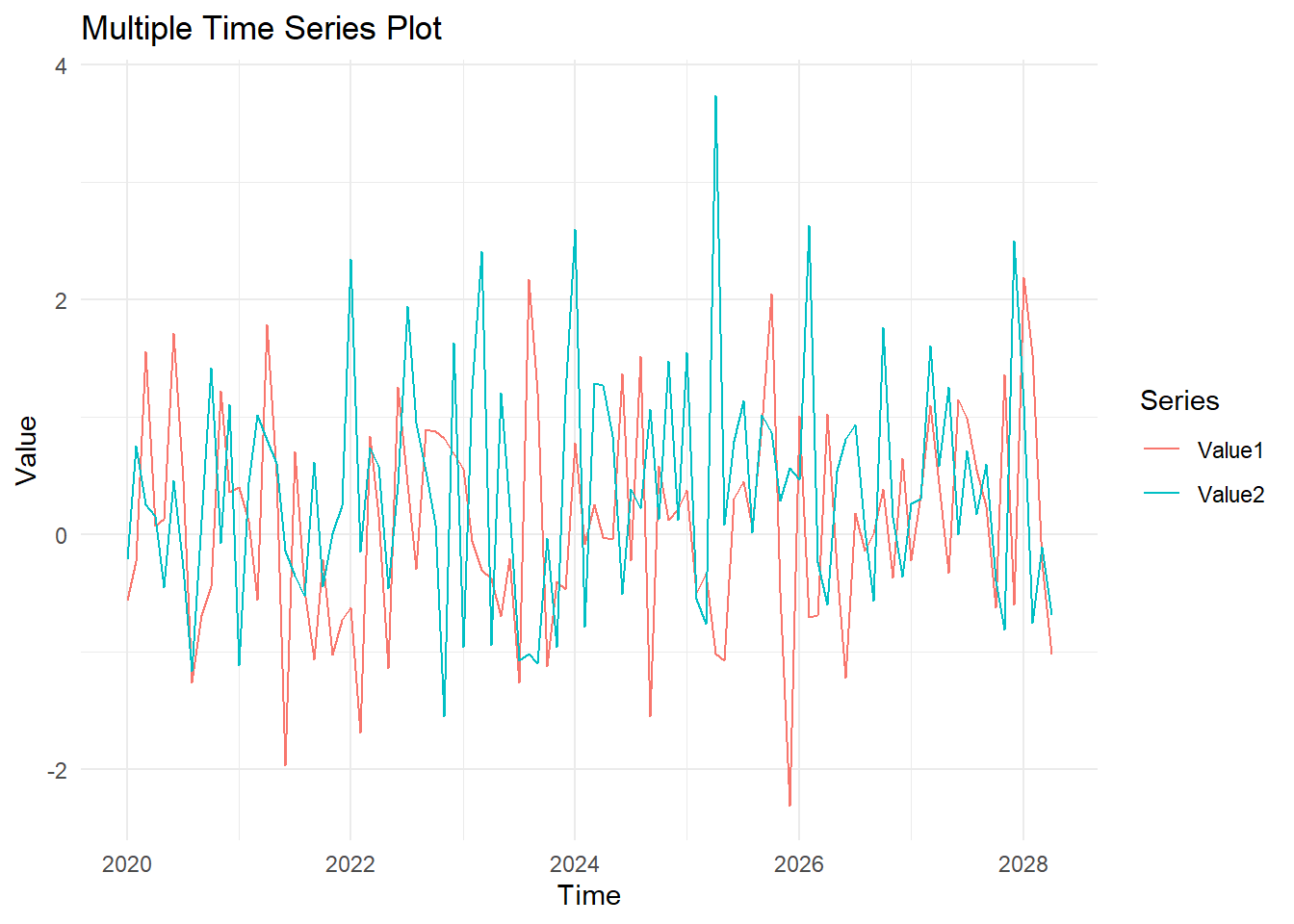
# Plot result
time_series_data2 <- ts(rnorm(100, mean = 0.5), start = c(2020, 1), frequency = 12)
time_series_df2 <- data.frame(
Time = time(time_series_data),
Value1 = as.numeric(time_series_data),
Value2 = as.numeric(time_series_data2)
)
time_series_df2_melt <- melt(time_series_df2, id.vars = "Time")
ggplot(time_series_df2_melt, aes(x = Time, y = value, color = variable)) +
geom_line() +
labs(title = "Multiple Time Series Plot", x = "Time", y = "Value", color = "Series") +
theme_minimal()Don't know how to automatically pick scale for object of type <ts>. Defaulting
to continuous.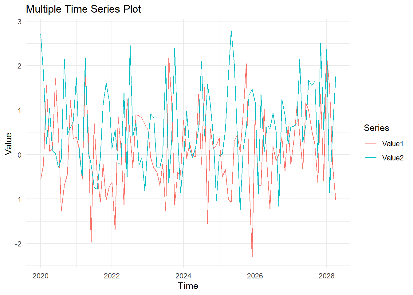
Here’s a comprehensive example of creating and customizing time series plots in R.
# Creating sample time series data
set.seed(123)
time_series_data <- ts(rnorm(100), start = c(2020, 1), frequency = 12)
# Basic time series plot
plot(time_series_data, main = "Basic Time Series Plot", xlab = "Time", ylab = "Value")
# Converting time series data to a data frame
time_series_df <- data.frame(
Time = time(time_series_data),
Value = as.numeric(time_series_data)
)
# Time series plot with ggplot2
ggplot(time_series_df, aes(x = Time, y = Value)) +
geom_line() +
labs(title = "Time Series Plot with ggplot2", x = "Time", y = "Value")
# Time series plot with trend line
ggplot(time_series_df, aes(x = Time, y = Value)) +
geom_line() +
geom_smooth(method = "loess", col = "red") +
labs(title = "Time Series Plot with Trend Line", x = "Time", y = "Value")
# Customized time series plot
ggplot(time_series_df, aes(x = Time, y = Value)) +
geom_line(col = "blue") +
geom_smooth(method = "loess", col = "red") +
labs(title = "Customized Time Series Plot", x = "Time", y = "Value") +
theme_minimal()
# Creating sample data for multiple time series
time_series_data2 <- ts(rnorm(100, mean = 0.5), start = c(2020, 1), frequency = 12)
time_series_df2 <- data.frame(
Time = time(time_series_data),
Value1 = as.numeric(time_series_data),
Value2 = as.numeric(time_series_data2)
)
# Melting the data frame for ggplot2
library(reshape2)
time_series_df2_melt <- melt(time_series_df2, id.vars = "Time")


# Plotting multiple time series

ggplot(time_series_df2_melt, aes(x = Time, y = value, color = variable)) +

  geom_line() +

  labs(title = "Multiple Time Series Plot", x = "Time", y = "Value", color = "Series") +

theme_minimal()# Plot results
time_series_data <- ts(rnorm(100), start = c(2020, 1), frequency = 12)
time_series_df <- data.frame(
Time = time(time_series_data),
Value = as.numeric(time_series_data)
)
ggplot(time_series_df, aes(x = Time, y = Value)) +
geom_line() +
labs(title = "Time Series Plot with ggplot2", x = "Time", y = "Value")Don't know how to automatically pick scale for object of type <ts>. Defaulting
to continuous.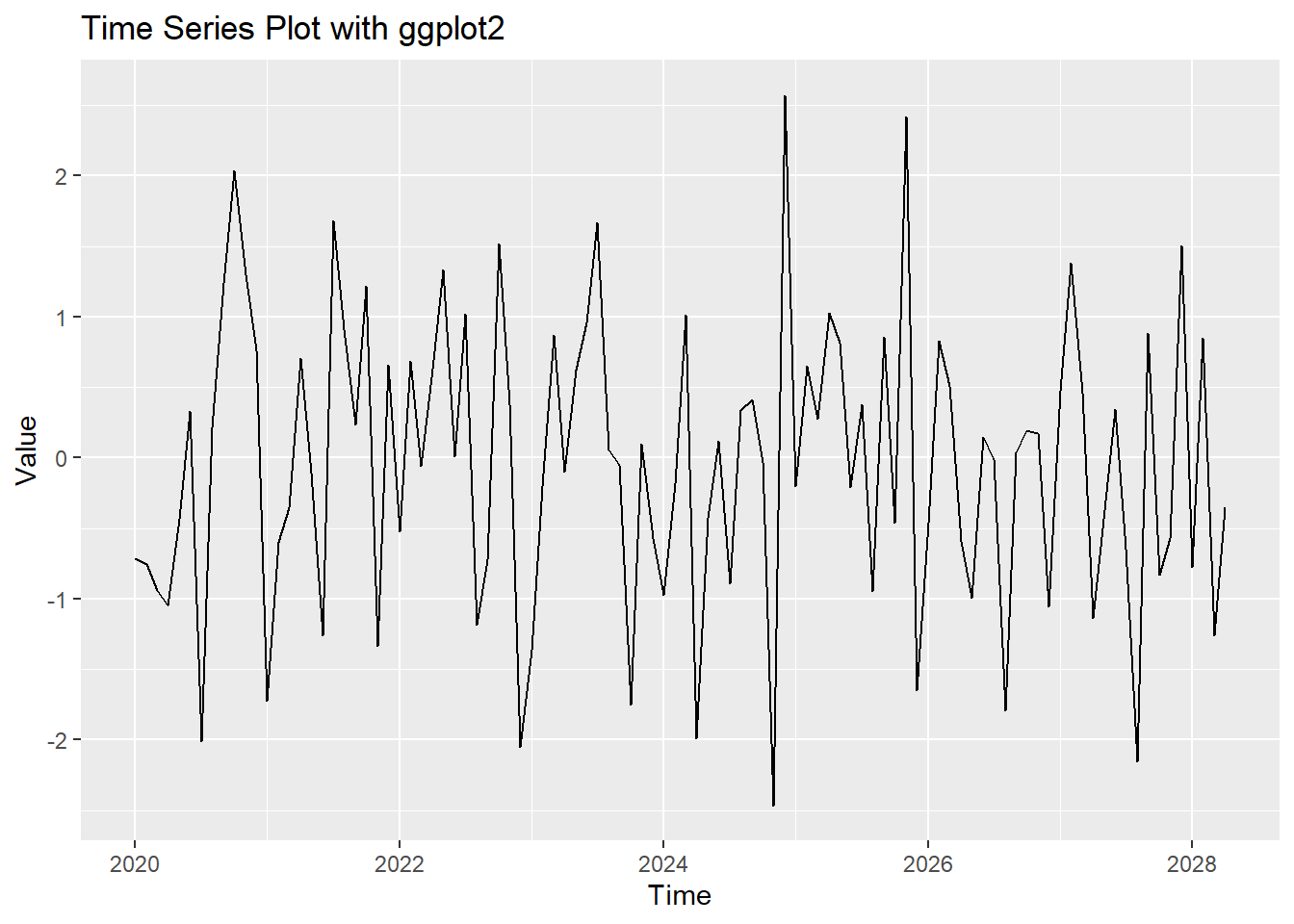
ggplot(time_series_df, aes(x = Time, y = Value)) +

  geom_line() +

  geom_smooth(method = "loess", col = "red") +

  labs(title = "Time Series Plot with Trend Line", x = "Time", y = "Value")
Don't know how to automatically pick scale for object of type <ts>. Defaulting
to continuous.
`geom_smooth()` using formula = 'y ~ x'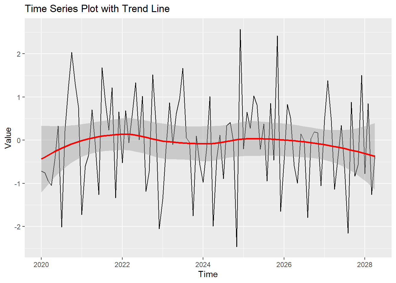
ggplot(time_series_df, aes(x = Time


, y = Value)) +

  geom_line(col = "blue") +

  geom_smooth(method = "loess", col = "red") +

  labs(title = "Customized Time Series Plot", x = "Time", y = "Value") +

  theme_minimal()
Don't know how to automatically pick scale for object of type <ts>. Defaulting
to continuous.
`geom_smooth()` using formula = 'y ~ x'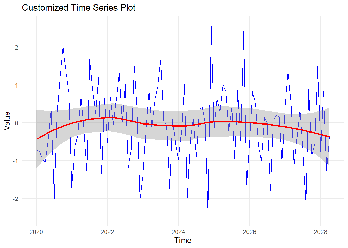
time_series_data2 <- ts(rnorm(100, mean = 0.5), start = c(2020, 1), frequency = 12)

time_series_df2 <- data.frame(

  Time = time(time_series_data),

  Value1 = as.numeric(time_series_data),

  Value2 = as.numeric(time_series_data2)

)


time_series_df2_melt <- melt(time_series_df2, id.vars = "Time")


ggplot(time_series_df2_melt, aes(x = Time, y = value, color = variable)) +

  geom_line() +

  labs(title = "Multiple Time Series Plot", x = "Time", y = "Value", color = "Series") +

  theme_minimal()
Don't know how to automatically pick scale for object of type <ts>. Defaulting
to continuous.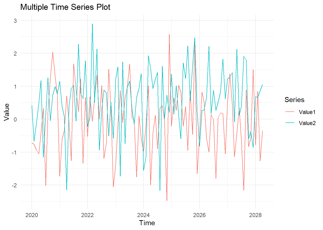
In this lecture, we covered how to create and customize time series plots in R. We explored various techniques for creating time series plots using base R and ggplot2, adding trend lines, customizing the plot appearance, and handling multiple time series. Time series plots are essential for analyzing trends, patterns, and seasonal variations in data.
For more detailed information, consider exploring the following resources:
If you found this lecture helpful, make sure to check out the other lectures in the R Graphs series. Happy plotting!