# Creating sample data

set.seed(123)

data <- rnorm(1000)


# Creating a basic histogram

hist(data, main = "Basic Histogram", xlab = "Value", ylab = "Frequency", col = "lightblue", border = "black")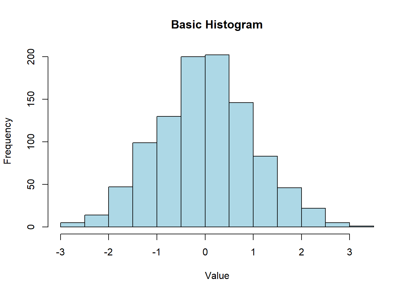
Histograms are a popular way to visualize the distribution of numerical data. They show the frequency of data points within specified ranges (bins) and are useful for understanding the underlying distribution, detecting outliers, and identifying patterns. In this lecture, we will learn how to create and customize histograms in R.
A histogram is a graphical representation of the distribution of a numerical variable. It displays the frequency of data points within specified intervals (bins).
Bins: Intervals that divide the range of the data.
Frequency: The count of data points within each bin.
Density: The frequency normalized to show the probability density.
Customizing histograms involves adjusting the number of bins, adding titles and labels, changing colors, and overlaying density plots.
A basic histogram displays the frequency of data points within specified bins.
# Creating sample data
set.seed(123)
data <- rnorm(1000)
# Creating a basic histogram
hist(data, main = "Basic Histogram", xlab = "Value", ylab = "Frequency", col = "lightblue", border = "black")
You can adjust the number of bins to change the granularity of the histogram.
# Creating a histogram with 20 bins

hist(data, breaks = 20, main = "Histogram with 20 Bins", xlab = "Value", ylab = "Frequency", col = "lightgreen", border = "black")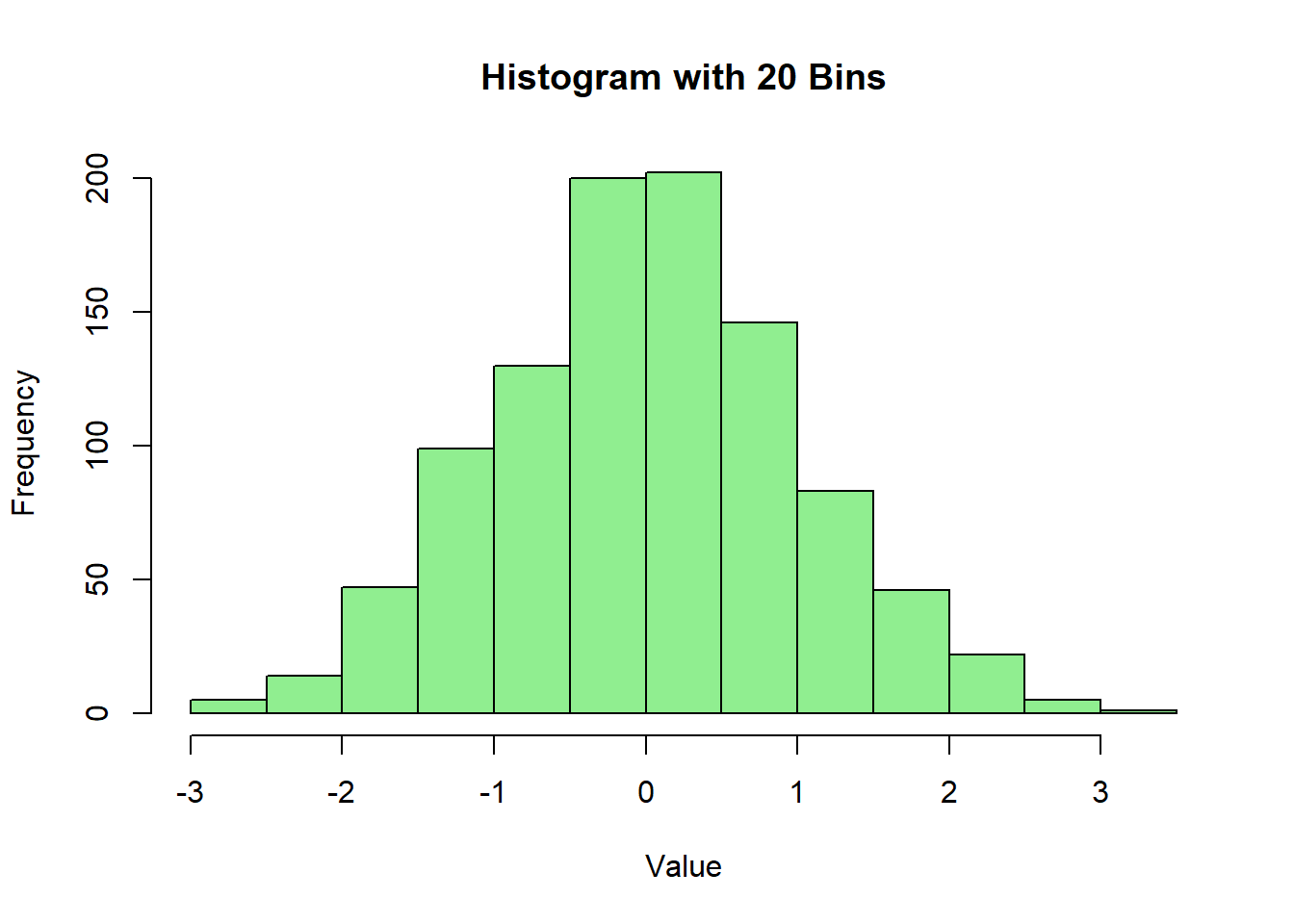
Overlaying a density plot can provide additional insight into the distribution of the data.
# Creating a histogram with a density plot

hist(data, breaks = 30, probability = TRUE, main = "Histogram with Density Plot", xlab = "Value", ylab = "Density", col = "lightcoral", border = "black")

lines(density(data), col = "blue", lwd = 2)
Customizing colors and borders can enhance the visual appeal of the histogram.
# Creating a histogram with customized colors and borders

hist(data, breaks = 30, main = "Customized Histogram", xlab = "Value", ylab = "Frequency", col = "purple", border = "yellow")
Adding titles and labels helps in understanding the context and meaning of the histogram.
# Creating a histogram with titles and labels

hist(data, breaks = 30, main = "Histogram with Titles and Labels", xlab = "X Axis Label", ylab = "Y Axis Label", col = "orange", border = "darkblue")
Here’s a comprehensive example of creating and customizing histograms in R.
# Creating sample data

set.seed(123)

data <- rnorm(1000)


# Basic histogram

hist(data, main = "Basic Histogram", xlab = "Value", ylab = "Frequency", col = "lightblue", border = "black")
# Histogram with 20 bins

hist(data, breaks = 20, main = "Histogram with 20 Bins", xlab = "Value", ylab = "Frequency", col = "lightgreen", border = "black")
# Histogram with density plot

hist(data, breaks = 30, probability = TRUE, main = "Histogram with Density Plot", xlab = "Value", ylab = "Density", col = "lightcoral", border = "black")

lines(density(data), col = "blue", lwd = 2)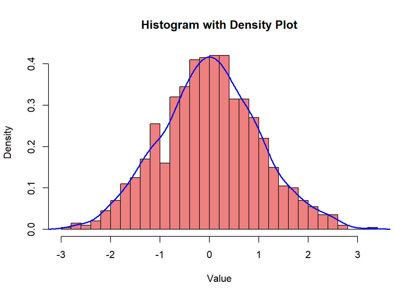
# Customized histogram

hist(data, breaks = 30, main = "Customized Histogram", xlab = "Value", ylab = "Frequency", col = "purple", border = "yellow")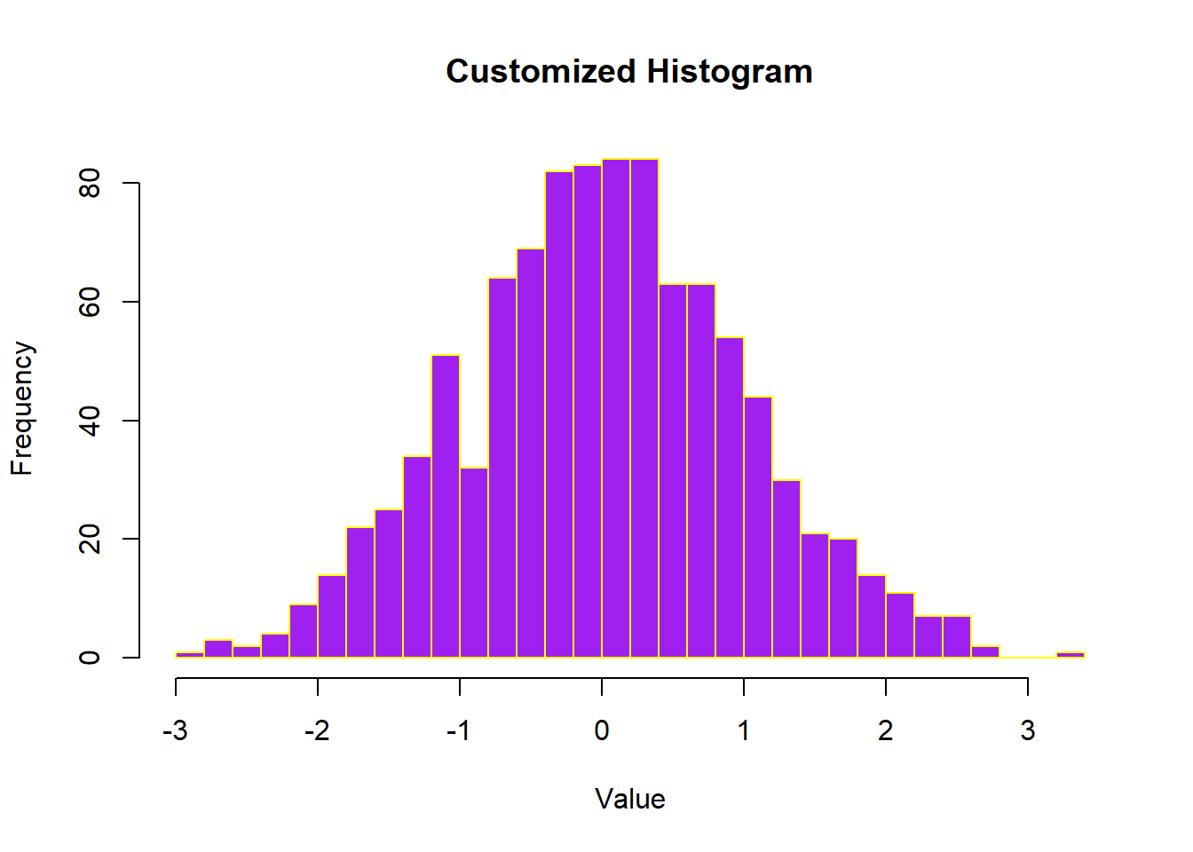
# Histogram with titles and labels

hist(data, breaks = 30, main = "Histogram with Titles and Labels", xlab = "X Axis Label", ylab = "Y Axis Label", col = "orange", border = "darkblue")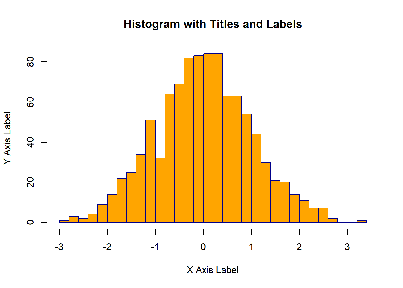
In this lecture, we covered how to create and customize histograms in R. We explored various techniques for adjusting the number of bins, adding density plots, customizing colors and borders, and adding titles and labels. Histograms are a powerful tool for visualizing the distribution of numerical data and can provide valuable insights into the underlying patterns.
For more detailed information, consider exploring the following resources:
If you found this lecture helpful, make sure to check out the other lectures in the R Graphs series. Happy plotting!