# Creating sample data

categories <- c("A", "B", "C", "D")

counts <- c(23, 45, 12, 56)


# Creating a basic pie chart

pie(counts, labels = categories, main = "Basic Pie Chart")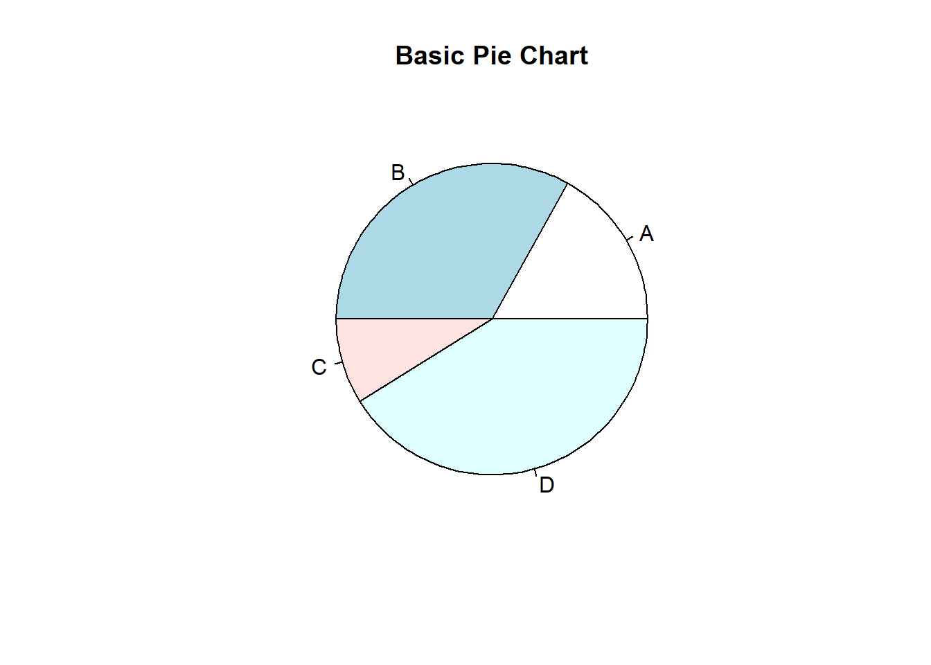
Pie charts are a common way to visualize the proportions of different categories in a dataset. They represent data as slices of a circle, with each slice corresponding to a category’s proportion. In this lecture, we will learn how to create and customize pie charts in R.
A pie chart is a circular graph divided into slices to illustrate numerical proportions. Each slice’s size is proportional to the value it represents.
Pie charts are best used for:
Displaying the proportions of categorical data.
Comparing parts of a whole.
Customizing pie charts involves adding titles, labels, colors, and legends to enhance readability and interpretability.
A basic pie chart displays the proportions of different categories.
# Creating sample data
categories <- c("A", "B", "C", "D")
counts <- c(23, 45, 12, 56)
# Creating a basic pie chart
pie(counts, labels = categories, main = "Basic Pie Chart")
You can add colors to the pie chart to differentiate between categories.
# Creating a pie chart with colors

pie(counts, labels = categories, main = "Pie Chart with Colors", col = rainbow(length(categories)))
Adding percentages to the pie chart slices provides more information about the proportions.
# Calculating percentages

percentages <- round(counts / sum(counts) * 100)

labels <- paste(categories, percentages, "%", sep = " ")


# Creating a pie chart with percentages

pie(counts, labels = labels, main = "Pie Chart with Percentages", col = rainbow(length(categories)))
Adding a legend helps in identifying the categories more easily.
# Creating a pie chart with legend

pie(counts, labels = categories, main = "Pie Chart with Legend", col = rainbow(length(categories)))

legend("topright", legend = categories, fill = rainbow(length(categories)))
Exploding slices (pulling them out from the center) can highlight specific categories.
# Creating a pie chart with exploded slices

pie(counts, labels = categories, main = "Pie Chart with Exploded Slices", col = rainbow(length(categories)), explode = 0.1)
Warning in text.default(1.1 * P$x, 1.1 * P$y, labels[i], xpd = TRUE, adj =
ifelse(P$x < : "explode" is not a graphical parameter
Warning in text.default(1.1 * P$x, 1.1 * P$y, labels[i], xpd = TRUE, adj =
ifelse(P$x < : "explode" is not a graphical parameter
Warning in text.default(1.1 * P$x, 1.1 * P$y, labels[i], xpd = TRUE, adj =
ifelse(P$x < : "explode" is not a graphical parameter
Warning in text.default(1.1 * P$x, 1.1 * P$y, labels[i], xpd = TRUE, adj =
ifelse(P$x < : "explode" is not a graphical parameterWarning in title(main = main, ...): "explode" is not a graphical parameter
# Set CRAN mirror
options(repos = c(CRAN = "https://cloud.r-project.org"))

# Check if plotrix is installed, if not, install it
if (!requireNamespace("plotrix", quietly = TRUE)) {
  install.packages("plotrix")
}

# Load plotrix library
library(plotrix)
Warning: package 'plotrix' was built under R version 4.3.2# Creating sample data (make sure these are defined earlier in your document)
categories <- c("A", "B", "C", "D")
counts <- c(23, 45, 12, 56)
# Creating a pie chart with exploded slices using the plotrix package
pie3D(counts, labels = categories, main = "Pie Chart with Exploded Slices",
col = rainbow(length(categories)), explode = 0.1)
Here’s a comprehensive example of creating and customizing pie charts in R.
# Creating sample data

categories <- c("A", "B", "C", "D")

counts <- c(23, 45, 12, 56)


# Basic pie chart

pie(counts, labels = categories, main = "Basic Pie Chart")
# Pie chart with colors

pie(counts, labels = categories, main = "Pie Chart with Colors", col = rainbow(length(categories)))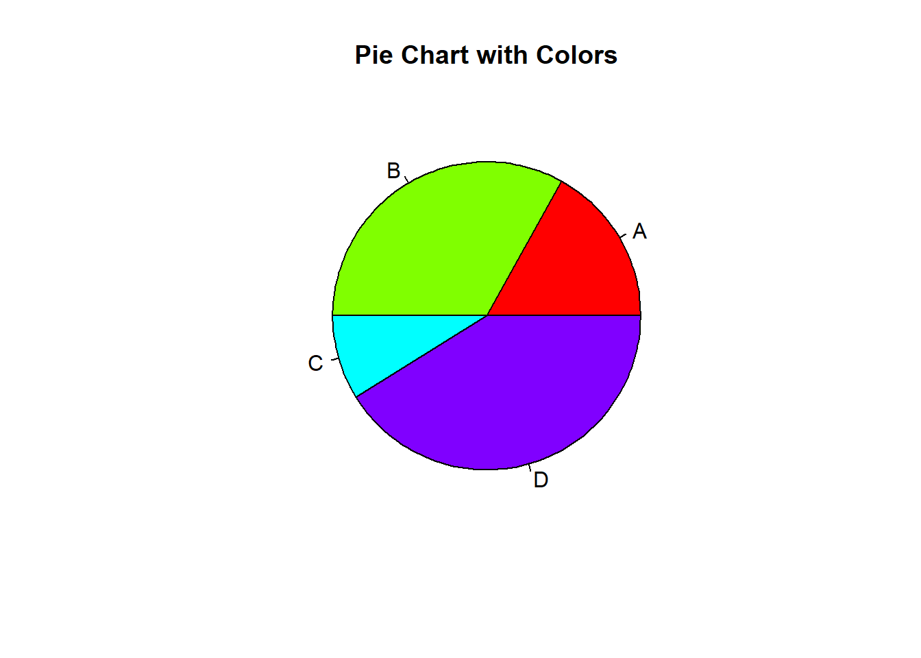
# Pie chart with percentages

percentages <- round(counts / sum(counts) * 100)

labels <- paste(categories, percentages, "%", sep = " ")

pie(counts, labels = labels, main = "Pie Chart with Percentages", col = rainbow(length(categories)))
# Pie chart with legend

pie(counts, labels = categories, main = "Pie Chart with Legend", col = rainbow(length(categories)))

legend("topright", legend = categories, fill = rainbow(length(categories)))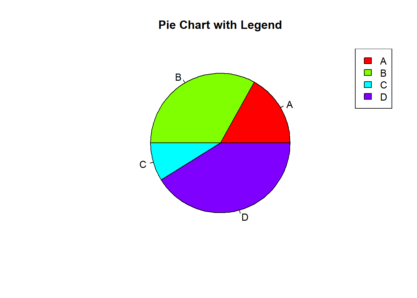
# Pie chart with exploded slices using the plotrix package

# Install the 'plotrix' package if not already installed

install.packages("plotrix")
Warning: package 'plotrix' is in use and will not be installedlibrary(plotrix)
pie3D(counts, labels = categories, main = "Pie Chart with Exploded Slices", col = rainbow(length(categories)), explode = 0.1)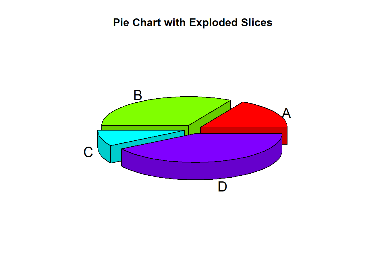
In this lecture, we covered how to create and customize pie charts in R. We explored various techniques for adding colors, percentages, legends, and exploding slices. Pie charts are a useful tool for visualizing categorical data and understanding the proportions of different categories.
For more detailed information, consider exploring the following resources:
If you found this lecture helpful, make sure to check out the other lectures in the R Graphs series. Happy plotting!