# Creating sample data

set.seed(123)

x <- rnorm(100)

y <- rnorm(100)


# Creating a scatter plot

plot(x, y, main = "Scatter Plot", xlab = "X Axis", ylab = "Y Axis", pch = 19, col = "blue")
Data visualization is a crucial aspect of data analysis, allowing us to explore, understand, and communicate insights from data. R offers a rich ecosystem for creating graphics, with powerful tools and packages that enable the creation of a wide variety of plots. In this lecture, we will introduce the basics of R graphics, focusing on the base R plotting system.
The base R plotting system provides a simple and flexible way to create a wide range of plots. It is built into R and does not require additional packages, making it a great starting point for creating visualizations.
Scatter Plot: Displays the relationship between two numerical variables.
Line Chart: Shows trends over time or ordered categories.
Bar Plot: Represents categorical data with rectangular bars.
Histogram: Visualizes the distribution of a numerical variable.
Box Plot: Summarizes the distribution of a numerical variable using five-number summary.
A scatter plot displays the relationship between two numerical variables.
# Creating sample data
set.seed(123)
x <- rnorm(100)
y <- rnorm(100)
# Creating a scatter plot
plot(x, y, main = "Scatter Plot", xlab = "X Axis", ylab = "Y Axis", pch = 19, col = "blue")
# Plot result

plot(x, y, main = "Scatter Plot", xlab = "X Axis", ylab = "Y Axis", pch = 19, col = "blue")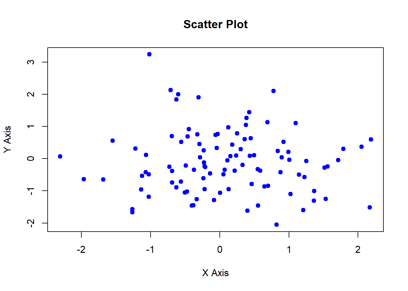
A line chart shows trends over time or ordered categories.
# Creating sample data

time <- 1:100

values <- cumsum(rnorm(100))


# Creating a line chart

plot(time, values, type = "l", main = "Line Chart", xlab = "Time", ylab = "Values", col = "red")
# Plot result

plot(time, values, type = "l", main = "Line Chart", xlab = "Time", ylab = "Values", col = "red")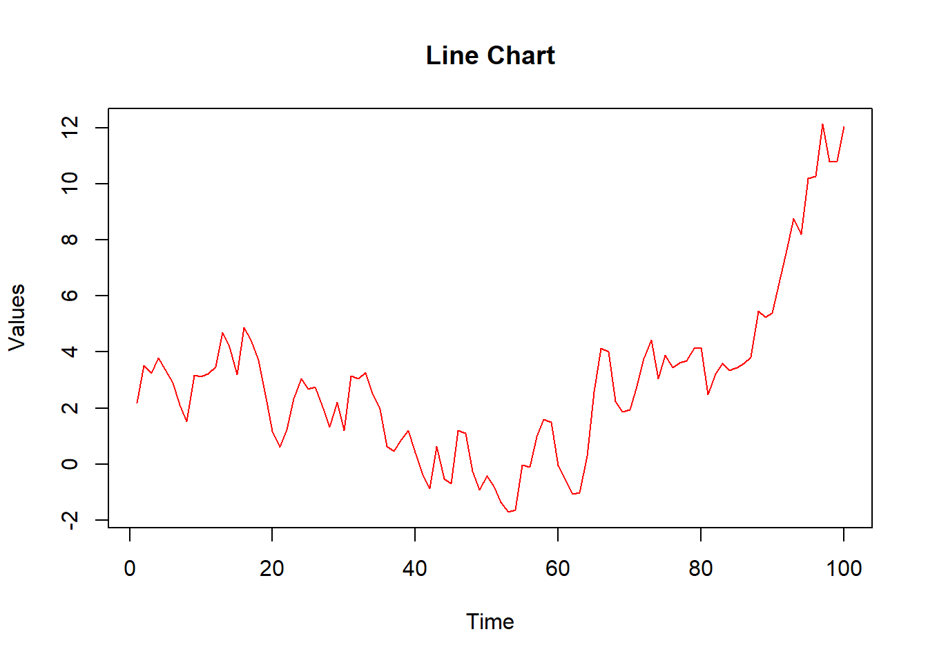
A bar plot represents categorical data with rectangular bars.
# Creating sample data

categories <- c("A", "B", "C", "D")

counts <- c(23, 45, 12, 56)


# Creating a bar plot

barplot(counts, names.arg = categories, main = "Bar Plot", xlab = "Category", ylab = "Count", col = "green")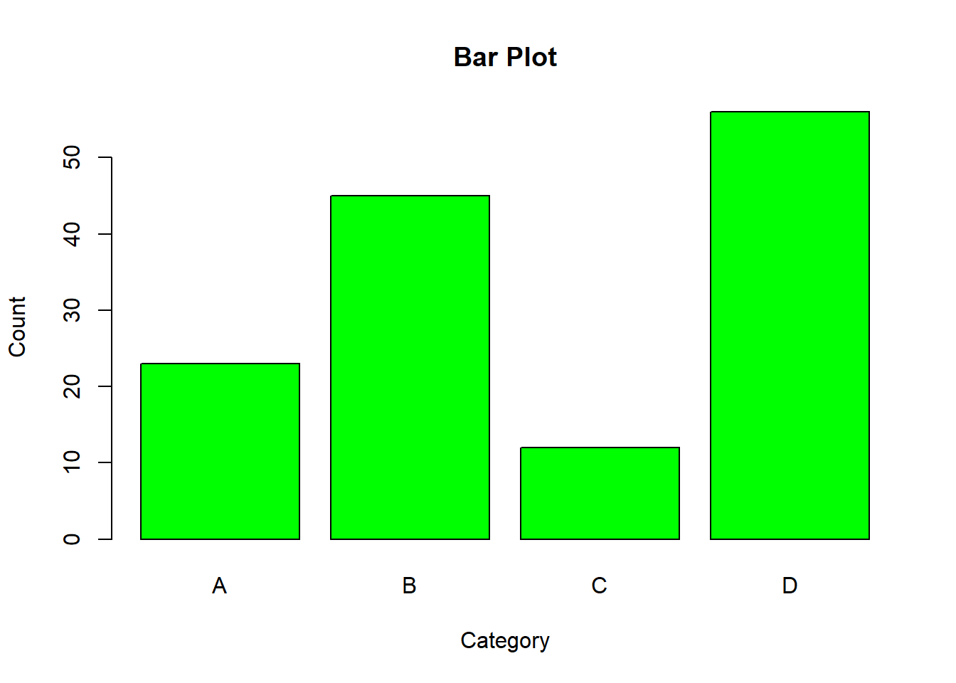
# Plot result

barplot(counts, names.arg = categories, main = "Bar Plot", xlab = "Category", ylab = "Count", col = "green")
A histogram visualizes the distribution of a numerical variable.
# Creating sample data

data <- rnorm(1000)


# Creating a histogram

hist(data, main = "Histogram", xlab = "Value", ylab = "Frequency", col = "purple", breaks = 30)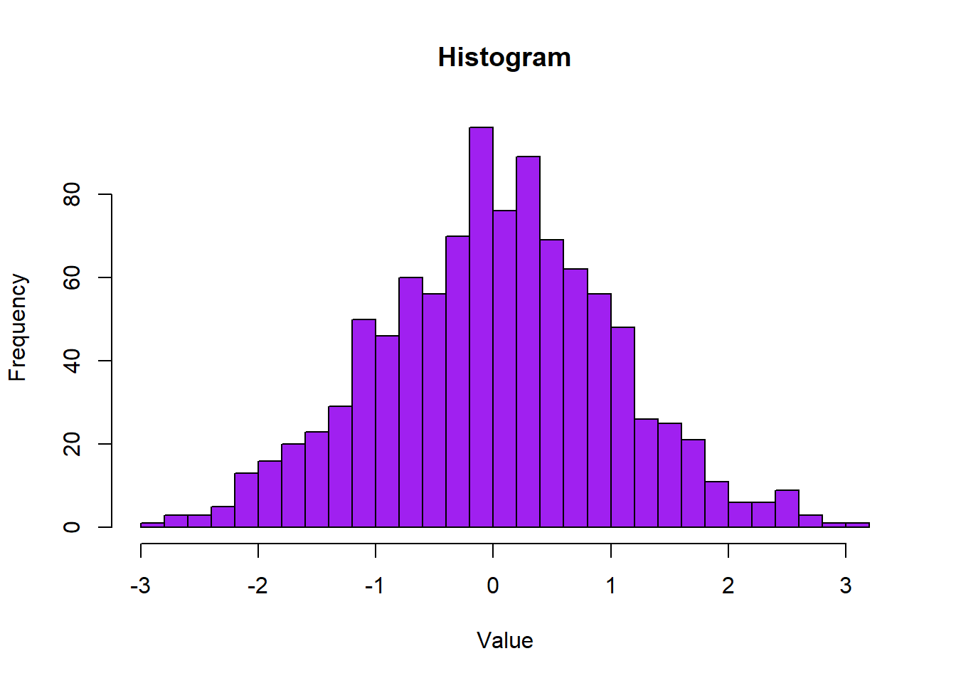
# Plot result

hist(data, main = "Histogram", xlab = "Value", ylab = "Frequency", col = "purple", breaks = 30)
A box plot summarizes the distribution of a numerical variable using the five-number summary.
# Creating sample data

data <- list(

  Group1 = rnorm(100, mean = 5),

  Group2 = rnorm(100, mean = 10),

  Group3 = rnorm(100, mean = 15)

)


# Creating a box plot

boxplot(data, main = "Box Plot", xlab = "Group", ylab = "Value", col = c("orange", "yellow", "cyan"))
# Plot result
boxplot(data, main = "Box Plot", xlab = "Group", ylab = "Value", col = c("orange", "yellow", "cyan"))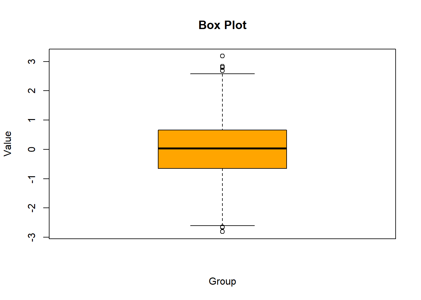
In this lecture, we introduced the basics of R graphics using the base R plotting system. We covered how to create and customize various types of plots, including scatter plots, line charts, bar plots, histograms, and box plots. These basic techniques form the foundation for more advanced data visualization in R.
For more detailed information, consider exploring the following resources:
If you found this lecture helpful, make sure to check out the other lectures in the R Graphs series. Happy plotting!