# Creating sample data

categories <- c("A", "B", "C", "D")

counts <- c(23, 45, 12, 56)


# Creating a vertical bar plot

barplot(counts, names.arg = categories, main = "Vertical Bar Plot", xlab = "Category", ylab = "Count", col = "blue")
Bar plots are a popular way to visualize categorical data by representing the frequency or count of categories with rectangular bars. Bar plots can be created in both horizontal and vertical orientations. In this lecture, we will learn how to create and customize bar plots in R.
Vertical Bar Plots: Bars are oriented vertically, representing the frequency or count of categories along the y-axis.
Horizontal Bar Plots: Bars are oriented horizontally, representing the frequency or count of categories along the x-axis.
Stacked Bar Plots: Bars are stacked on top of each other to show the total frequency or count of sub-categories.
Grouped Bar Plots: Bars are grouped together to compare different sub-categories side by side.
Customizing bar plots involves adding titles, labels, colors, and legends to enhance the readability and interpretability of the plots.
A vertical bar plot represents the frequency or count of categories along the y-axis.
# Creating sample data
categories <- c("A", "B", "C", "D")
counts <- c(23, 45, 12, 56)
# Creating a vertical bar plot
barplot(counts, names.arg = categories, main = "Vertical Bar Plot", xlab = "Category", ylab = "Count", col = "blue")
# Plot result

barplot(counts, names.arg = categories, main = "Vertical Bar Plot", xlab = "Category", ylab = "Count", col = "blue")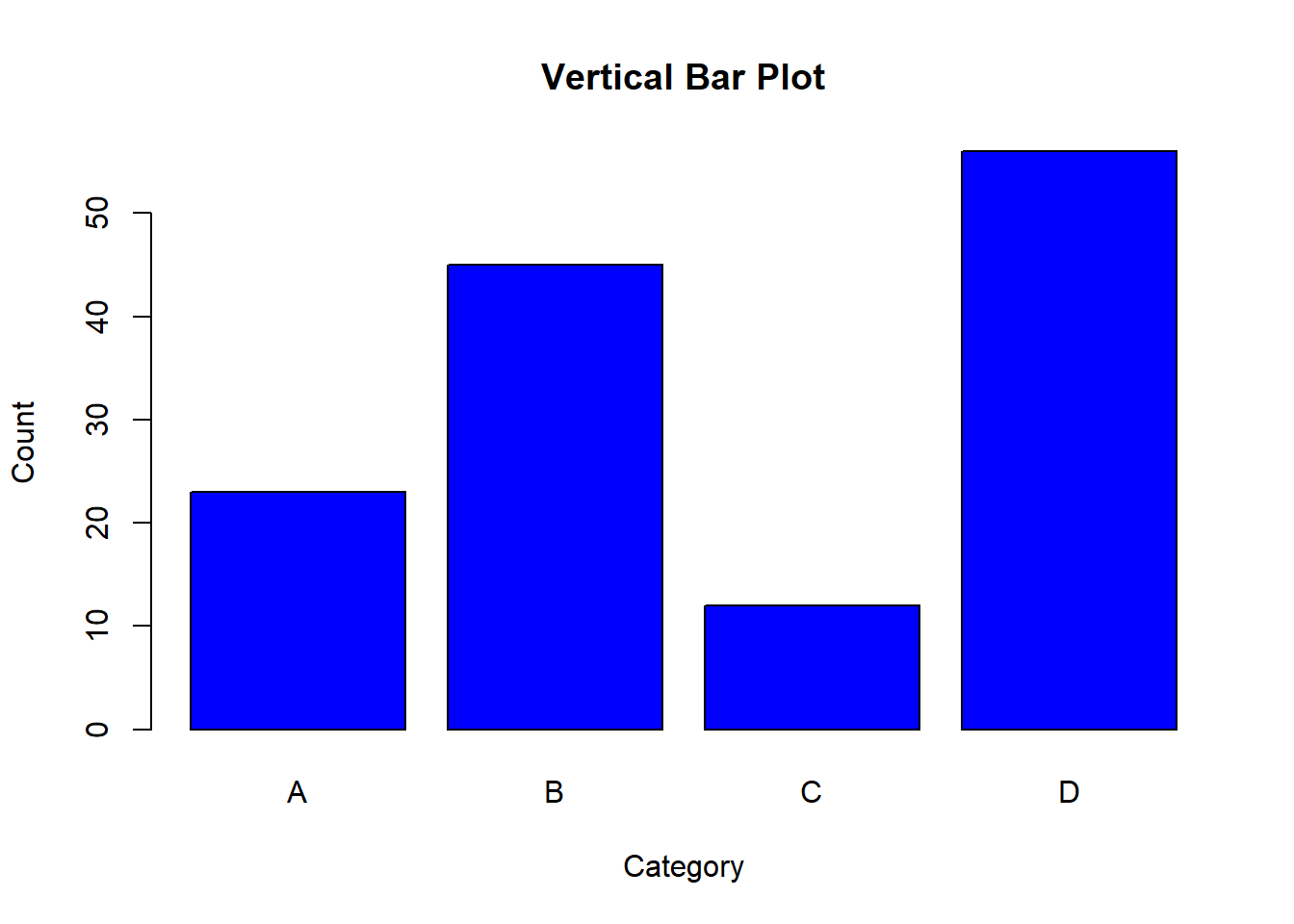
A horizontal bar plot represents the frequency or count of categories along the x-axis.
# Creating a horizontal bar plot

barplot(counts, names.arg = categories, main = "Horizontal Bar Plot", xlab = "Count", ylab = "Category", col = "green", horiz = TRUE)
# Plot result
barplot(counts, names.arg = categories, main = "Horizontal Bar Plot", xlab = "Count", ylab = "Category", col = "green", horiz = TRUE)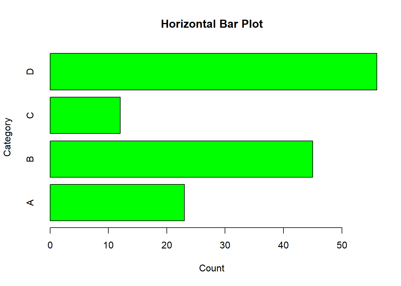
A stacked bar plot shows the total frequency or count of sub-categories by stacking bars on top of each other.
# Creating sample data for stacked bar plot

counts_matrix <- matrix(c(10, 15, 20, 25, 15, 10, 5, 30), nrow = 2)


# Creating a stacked bar plot

barplot(counts_matrix, beside = FALSE, names.arg = categories, main = "Stacked Bar Plot", xlab = "Category", ylab = "Count", col = c("blue", "red"))

legend("topright", legend = c("Group 1", "Group 2"), fill = c("blue", "red"))
# Plot result

barplot(counts_matrix, beside = FALSE, names.arg = categories, main = "Stacked Bar Plot", xlab = "Category", ylab = "Count", col = c("blue", "red"))

legend("topright", legend = c("Group 1", "Group 2"), fill = c("blue", "red"))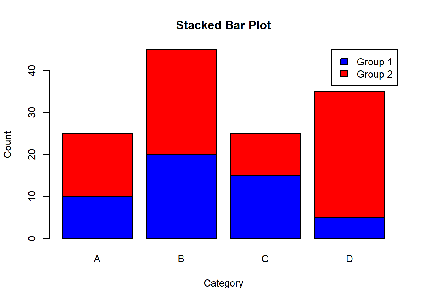
A grouped bar plot compares different sub-categories side by side.
# Creating a grouped bar plot

barplot(counts_matrix, beside = TRUE, names.arg = categories, main = "Grouped Bar Plot", xlab = "Category", ylab = "Count", col = c("blue", "red"))

legend("topright", legend = c("Group 1", "Group 2"), fill = c("blue", "red"))
# Plot result
barplot(counts_matrix, beside = TRUE, names.arg = categories, main = "Grouped Bar Plot", xlab = "Category", ylab = "Count", col = c("blue", "red"))
legend("topright", legend = c("Group 1", "Group 2"), fill = c("blue", "red"))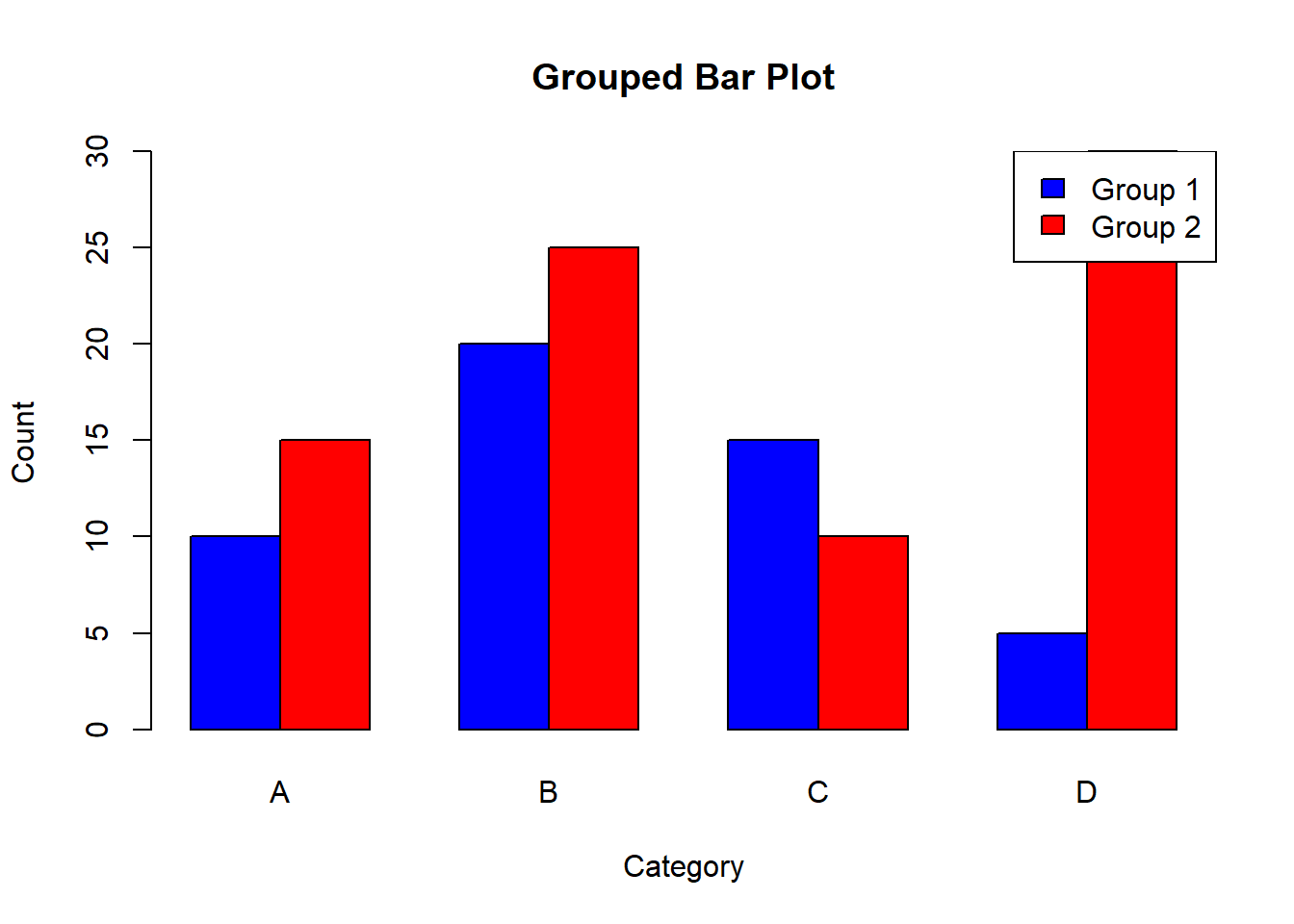
Adding titles, labels, and colors helps in understanding the context and meaning of the bar plot.
# Creating a vertical bar plot with titles, labels, and colors

barplot(counts, names.arg = categories, main = "Customized Vertical Bar Plot", xlab = "Category", ylab = "Count", col = c("purple", "orange", "cyan", "magenta"))
# Plot result
barplot(counts, names.arg = categories, main = "Customized Vertical Bar Plot", xlab = "Category", ylab = "Count", col = c("purple", "orange", "cyan", "magenta"))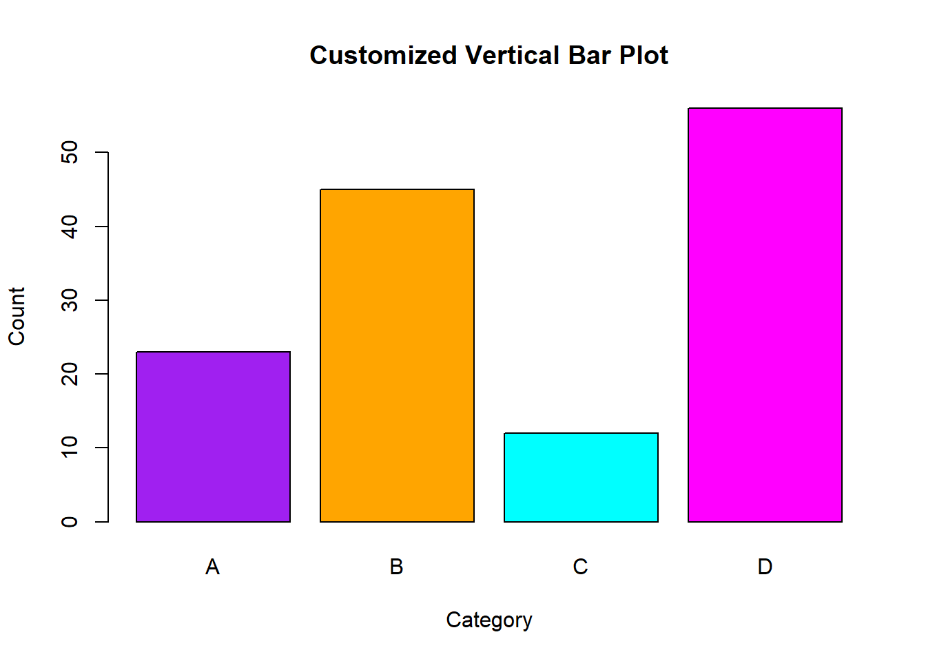
In this lecture, we covered how to create and customize bar plots in R. We explored various types of bar plots, including vertical, horizontal, stacked, and grouped bar plots. We also learned how to add titles, labels, and colors to enhance the readability and interpretability of the plots.
For more detailed information, consider exploring the following resources:
If you found this lecture helpful, make sure to check out the other lectures in the R Graphs series. Happy plotting!