library(ggplot2)Warning: package 'ggplot2' was built under R version 4.3.3Your Name
June 21, 2024
Faceting in ggplot2 allows you to create multiple plots based on the values of one or more categorical variables. This technique is useful for comparing data across different levels of a factor or for visualizing complex data in a more organized manner. In this lecture, we will learn how to use faceting in ggplot2 to create faceted plots.
Faceting is the process of splitting data into subsets and creating a plot for each subset. In ggplot2, faceting can be done using the facet_wrap() or facet_grid() functions.
facet_wrap(): Creates a series of plots wrapped into a single dimension (either rows or columns).
facet_grid(): Creates a grid of plots based on the values of two or more variables.
If you haven’t installed ggplot2 yet, you can install it using the following command:
Load the ggplot2 package:
The facet_wrap() function is used to create a series of plots wrapped into a single dimension.
# Creating sample data

set.seed(123)

data <- data.frame(

  x = rnorm(100),

  y = rnorm(100),

  group = sample(c("Group 1", "Group 2", "Group 3", "Group 4"), 100, replace = TRUE)

)


# Creating a scatter plot with facet_wrap()

ggplot(data, aes(x = x, y = y)) +

  geom_point() +

  facet_wrap(~ group) +

  labs(title = "Scatter Plot with facet_wrap()", x = "X Axis", y = "Y Axis")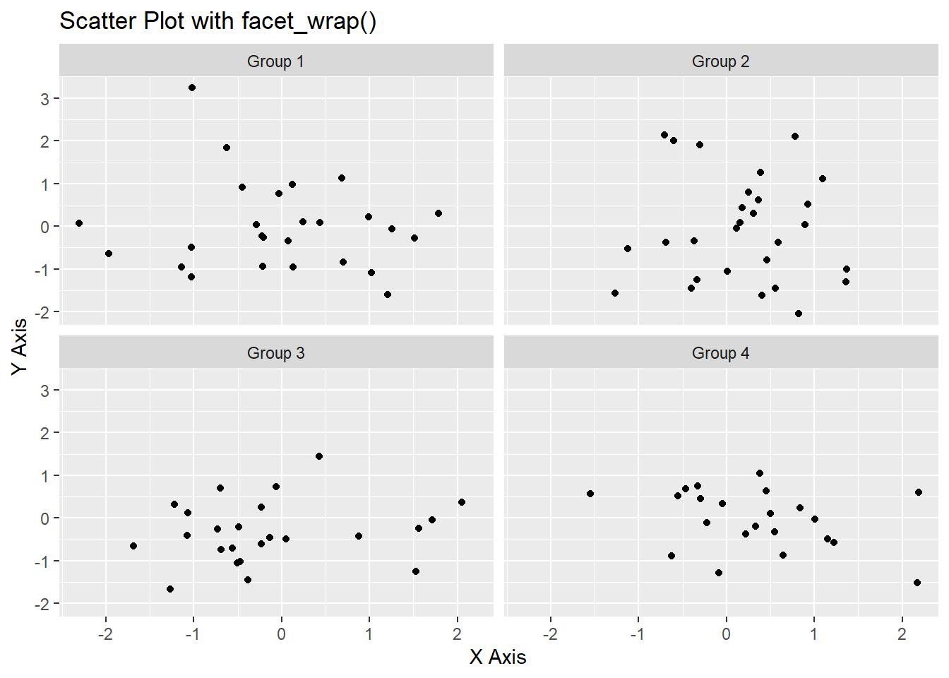
The facet_grid() function is used to create a grid of plots based on the values of two or more variables.
# Creating sample data with two grouping variables

data <- data.frame(

  x = rnorm(100),

  y = rnorm(100),

  group1 = sample(c("Group 1", "Group 2"), 100, replace = TRUE),

  group2 = sample(c("Type A", "Type B"), 100, replace = TRUE)

)


# Creating a scatter plot with facet_grid()

ggplot(data, aes(x = x, y = y)) +

  geom_point() +

  facet_grid(group1 ~ group2) +

  labs(title = "Scatter Plot with facet_grid()", x = "X Axis", y = "Y Axis")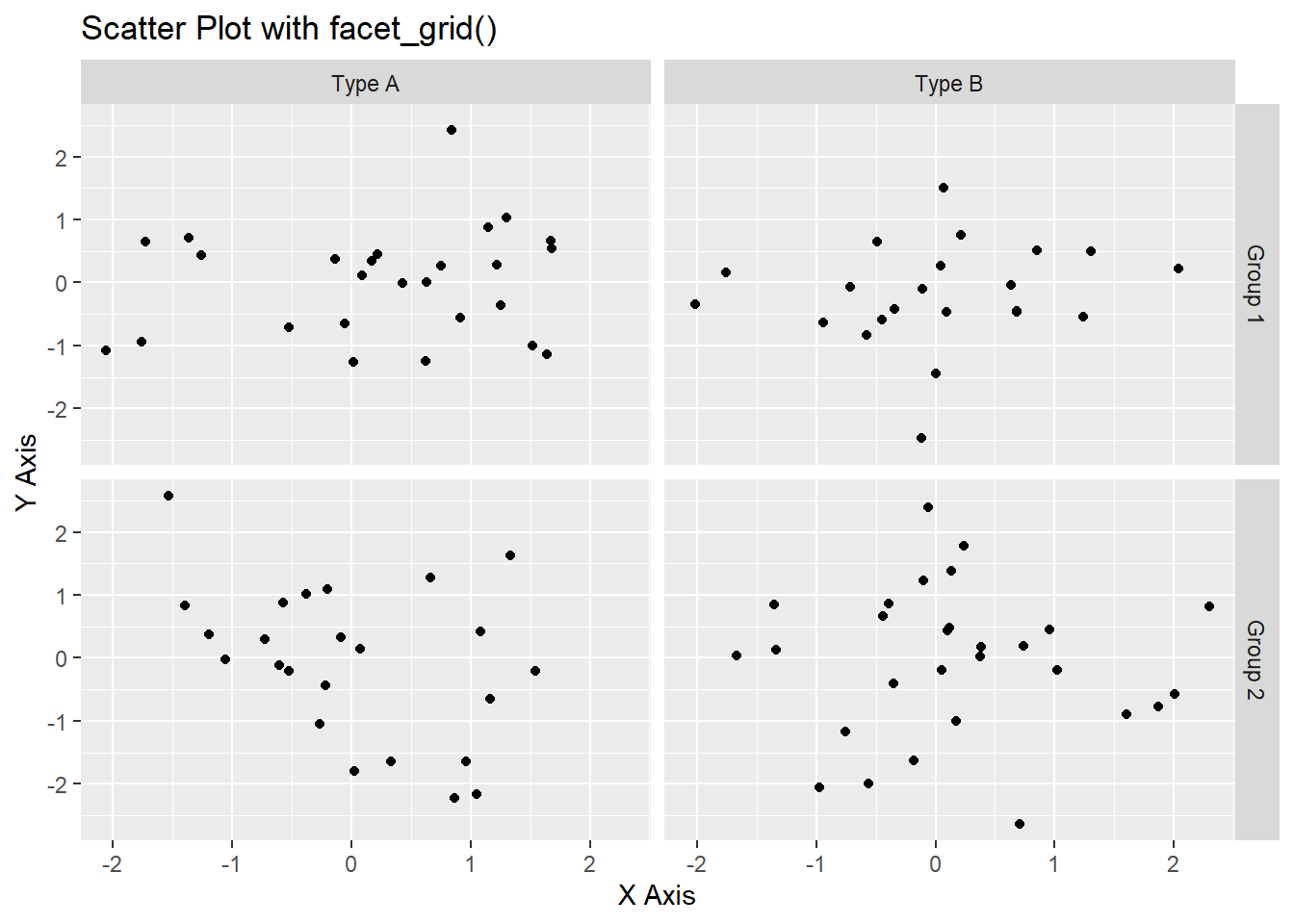
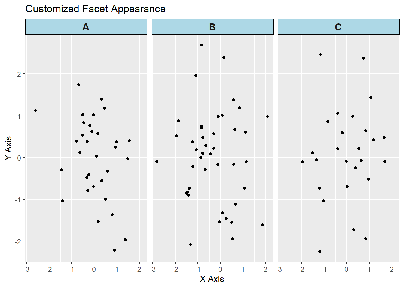
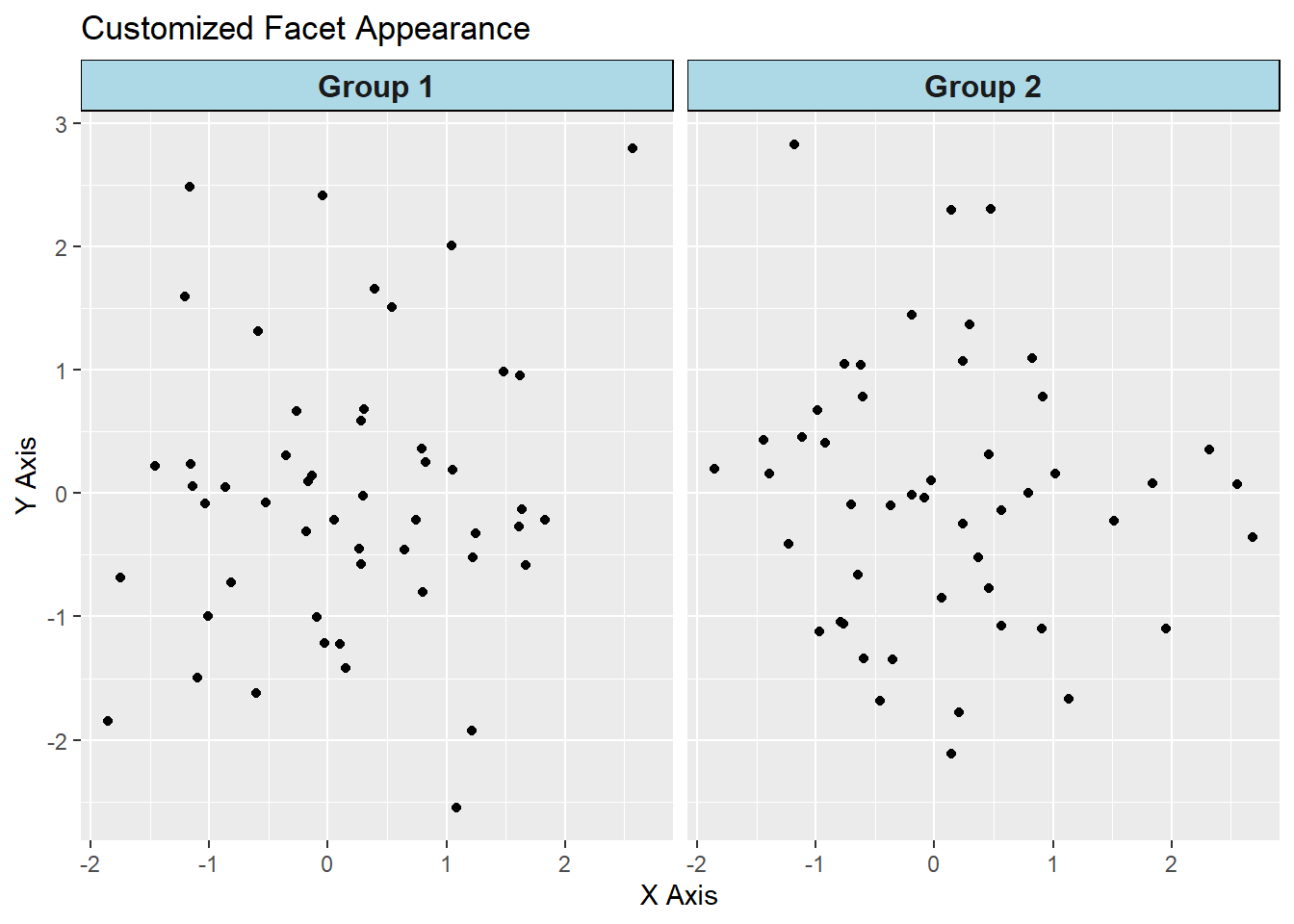
You can customize the appearance of the facets using various theme elements.
Warning: package 'dplyr' was built under R version 4.3.2
Attaching package: 'dplyr'The following objects are masked from 'package:stats':
filter, lagThe following objects are masked from 'package:base':
intersect, setdiff, setequal, union# Sample data with a 'group' variable
data <- data.frame(
x = rnorm(100),
y = rnorm(100),
group = sample(c("A", "B", "C"), 100, replace = TRUE)
)
# Customized facet plot
ggplot(data, aes(x = x, y = y)) +
geom_point() +
facet_wrap(~ group) +
labs(
title = "Customized Facet Appearance",
x = "X Axis",
y = "Y Axis"
) +
theme(
strip.background = element_rect(fill = "lightblue", color = "black"),
strip.text = element_text(size = 12, face = "bold")
)
You can adjust scales and space between facets using the scales and space parameters in facet_wrap() and facet_grid().
Here’s a comprehensive example of using faceting in ggplot2.
# Creating sample data

data <- data.frame(

  x = rnorm(100),

  y = rnorm(100),

  group1 = sample(c("Group 1", "Group 2"), 100, replace = TRUE),

  group2 = sample(c("Type A", "Type B"), 100, replace = TRUE)

)


# Scatter plot with facet_wrap()

ggplot(data, aes(x = x, y = y)) +

  geom_point() +

  facet_wrap(~ group1) +

  labs(title = "Scatter Plot with facet_wrap()", x = "X Axis", y = "Y Axis")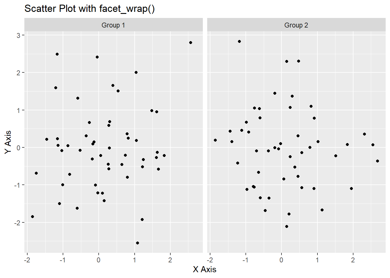
# Scatter plot with facet_grid()

ggplot(data, aes(x = x, y = y)) +

  geom_point() +

  facet_grid(group1 ~ group2) +

  labs(title = "Scatter Plot with facet_grid()", x = "X Axis", y = "Y Axis")
# Customized facet appearance

ggplot(data, aes(x = x, y = y)) +

  geom_point() +

  facet_wrap(~ group1) +

  labs(title = "Customized Facet Appearance", x = "X Axis", y = "Y Axis") +

  theme(

    strip.background = element_rect(fill = "lightblue", color = "black"),

    strip.text = element_text(size = 12, face = "bold")

  )
# Scatter plot with free scales

ggplot(data, aes(x = x, y = y)) +

  geom_point() +

  facet_wrap(~ group1, scales = "free") +

  labs(title = "Scatter Plot with Free Scales", x = "X Axis", y = "Y Axis")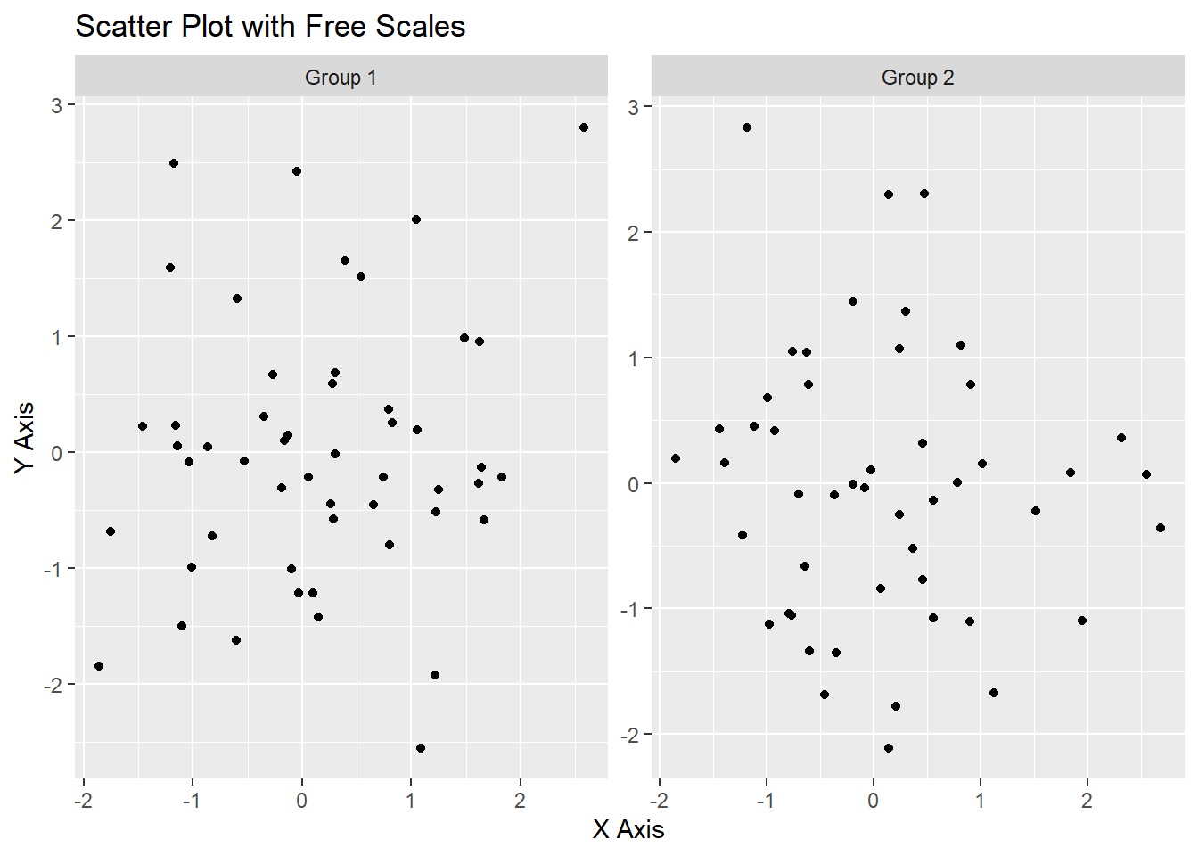
# Plot results

ggplot(data, aes(x = x, y = y)) +

  geom_point() +

  facet_wrap(~ group1) +

  labs(title = "Scatter Plot with facet_wrap()", x = "X Axis", y = "Y Axis")
ggplot(data, aes(x = x, y = y)) +

  geom_point() +

  facet_grid(group1 ~ group2) +

  labs(title = "Scatter Plot with facet_grid()", x = "X Axis", y = "Y Axis")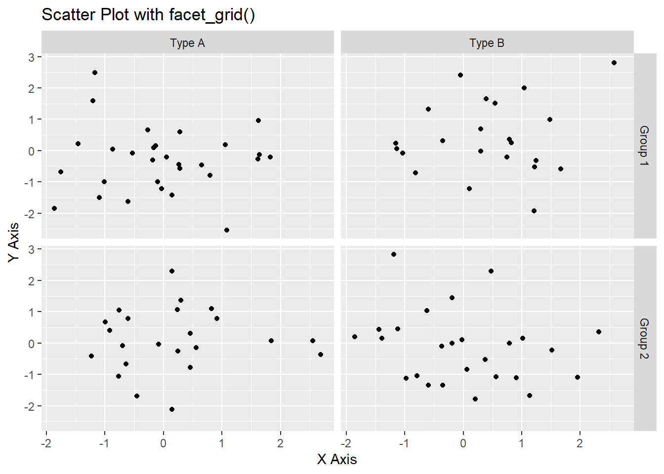
ggplot(data, aes(x = x, y = y)) +

  geom_point() +

  facet_wrap(~ group1) +

  labs(title = "Customized Facet Appearance", x = "X Axis", y = "Y Axis") +

  theme(

    strip.background = element_rect(fill = "lightblue", color = "black"),

    strip.text = element_text(size = 12, face = "bold")

  )
ggplot(data, aes(x = x, y = y)) +

  geom_point() +

  facet_wrap(~ group1, scales = "free") +

  labs(title = "Scatter Plot with Free Scales", x = "X Axis", y = "Y Axis")
In this lecture, we covered how to use faceting in ggplot2 to create multiple plots based on the values of one or more categorical variables. We explored various techniques for using facet_wrap() and facet_grid(), customizing facet appearance, and adjusting scales and space between facets. Faceting is a powerful tool for visualizing complex data in a more organized manner.
For more detailed information, consider exploring the following resources:
If you found this lecture helpful, make sure to check out the other lectures in the R Graphs series. Happy plotting!