library(ggplot2)Warning: package 'ggplot2' was built under R version 4.3.3TERE
June 21, 2024
ggplot2 is a powerful and flexible package for creating data visualizations in R. It implements the grammar of graphics, which provides a coherent system for describing and building graphs. In this lecture, we will learn how to create and customize plots using ggplot2 in R.
The grammar of graphics is a framework for data visualization that breaks down graphs into semantic components such as data, aesthetics, and geometric objects. ggplot2 is based on this framework, making it easier to create complex and customizable plots.
The basic structure of a ggplot2 plot includes:
Data: The dataset to be visualized.
Aesthetics (aes): The mappings between data variables and visual properties (e.g., x and y coordinates, color, size).
Geometries (geom): The geometric objects that represent data points (e.g., points, lines, bars).
If you haven’t installed ggplot2 yet, you can install it using the following command:
Load the ggplot2 package:
A basic scatter plot displays the relationship between two numerical variables.
Adding titles and labels helps in understanding the context and meaning of the plot.
You can customize colors and shapes using the color and shape aesthetics.
Adding trend lines can help in visualizing the relationship between the variables.
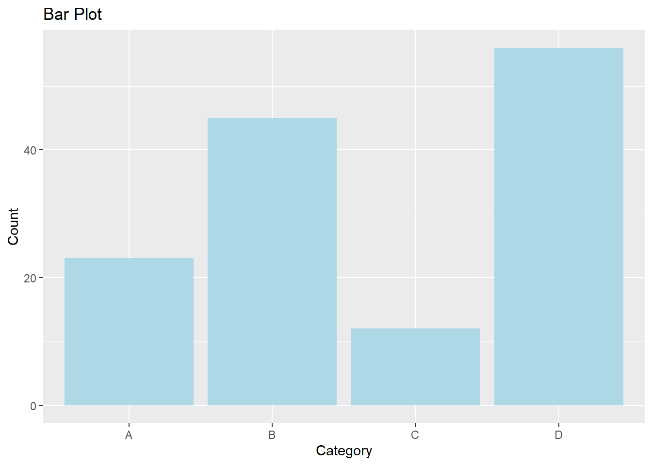
Bar plots represent categorical data with rectangular bars.
# Creating sample data

categories <- c("A", "B", "C", "D")

counts <- c(23, 45, 12, 56)

data_bar <- data.frame(categories, counts)


# Creating a bar plot

ggplot(data_bar, aes(x = categories, y = counts)) +

  geom_bar(stat = "identity", fill = "lightblue") +

  labs(title = "Bar Plot", x = "Category", y = "Count")
Histograms visualize the distribution of a numerical variable.
Here’s a comprehensive example of creating and customizing various plots using ggplot2 in R.
# Creating sample data

set.seed(123)

data <- data.frame(x = rnorm(100), y = rnorm(100))

data$group <- sample(c("Group 1", "Group 2"), 100, replace = TRUE)


# Basic scatter plot

ggplot(data, aes(x = x, y = y)) +

  geom_point() +

  labs(title = "Basic Scatter Plot", x = "X Axis", y = "Y Axis")


# Scatter plot with titles and labels

ggplot(data, aes(x = x, y = y)) +

  geom_point() +

  labs(title = "Scatter Plot with Titles and Labels", x = "X Axis Label", y = "Y Axis Label")


# Scatter plot with custom colors and shapes

ggplot(data, aes(x = x, y = y, color = group, shape = group)) +

  geom_point() +

  labs(title = "Scatter Plot with Custom Colors and Shapes", x = "X Axis", y = "Y Axis")


# Scatter plot with trend line

ggplot(data, aes(x = x, y = y)) +

  geom_point() +

  geom_smooth(method = "lm", se = FALSE, color = "red") +

  labs(title = "Scatter Plot with Trend Line", x = "X Axis", y = "Y Axis")


# Bar plot

categories <- c("A", "B", "C", "D")

counts <- c(23, 45, 12, 56)

data_bar <- data.frame(categories, counts)

ggplot(data_bar, aes(x = categories, y = counts)) +

  geom_bar(stat = "identity", fill = "lightblue") +

  labs(title = "Bar Plot", x = "Category", y = "Count")


# Histogram

ggplot(data, aes(x = x)) +

  geom_histogram(binwidth = 0.5, fill = "lightgreen", color = "black") +

labs(title = "Histogram", x = "Value", y = "Frequency")In this lecture, we covered how to create and customize plots using ggplot2 in R. We explored various techniques for adding titles, labels, colors, shapes, trend lines, and creating different types of plots like scatter plots, bar plots, and histograms. ggplot2 is a powerful tool for data visualization and provides a coherent system for building complex and customizable plots.
For more detailed information, consider exploring the following resources:
If you found this lecture helpful, make sure to check out the other lectures in the R Graphs series. Happy plotting!