# Creating sample data

set.seed(123)

data <- rnorm(100)


# Creating a basic box plot

boxplot(data, main = "Basic Box Plot", ylab = "Value", col = "lightblue")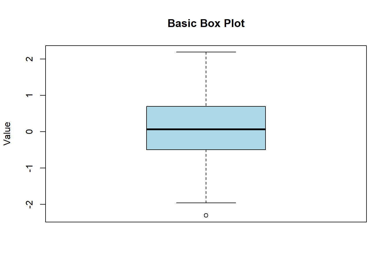
Box plots, also known as box-and-whisker plots, are a standardized way of displaying the distribution of data based on a five-number summary: minimum, first quartile (Q1), median, third quartile (Q3), and maximum. They are useful for identifying outliers and understanding the spread and skewness of the data. In this lecture, we will learn how to create and customize box plots in R.
A box plot displays the distribution of a dataset based on a five-number summary:
Minimum: The smallest observation
First Quartile (Q1): The 25th percentile
Median: The 50th percentile (middle value)
Third Quartile (Q3): The 75th percentile
Maximum: The largest observation
Box: Represents the interquartile range (IQR), which contains the middle 50% of the data.
Whiskers: Extend from the box to the minimum and maximum values within 1.5 * IQR from Q1 and Q3.
Outliers: Data points outside the whiskers.
Customizing box plots involves adding titles, labels, colors, and notches to enhance readability and interpretability.
A basic box plot displays the distribution of a single numerical variable.
# Creating sample data
set.seed(123)
data <- rnorm(100)
# Creating a basic box plot
boxplot(data, main = "Basic Box Plot", ylab = "Value", col = "lightblue")
You can create box plots for multiple groups to compare distributions.
# Creating sample data for multiple groups

data <- data.frame(

  value = c(rnorm(50, mean = 5), rnorm(50, mean = 10)),

  group = rep(c("Group 1", "Group 2"), each = 50)

)


# Creating a box plot for multiple groups

boxplot(value ~ group, data = data, main = "Box Plot for Multiple Groups", xlab = "Group", ylab = "Value", col = c("lightgreen", "lightcoral"))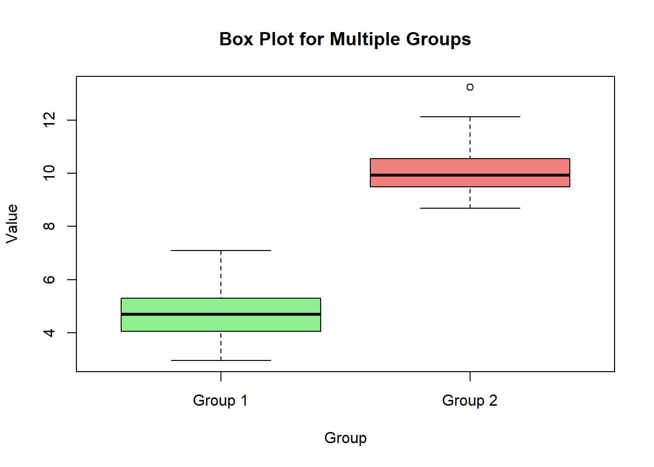
Notches in a box plot represent the confidence interval around the median, which can be used to compare medians between groups.
# Creating a box plot with notches

boxplot(value ~ group, data = data, main = "Box Plot with Notches", xlab = "Group", ylab = "Value", col = c("lightgreen", "lightcoral"), notch = TRUE)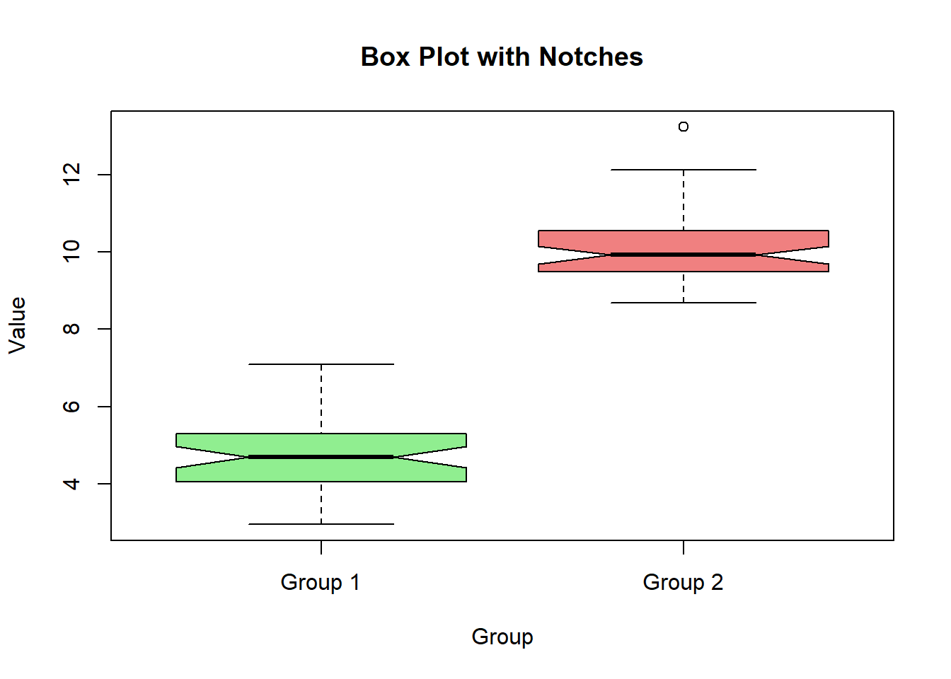
A horizontal box plot can be useful for displaying distributions when there are many categories.
# Creating a horizontal box plot

boxplot(value ~ group, data = data, main = "Horizontal Box Plot", xlab = "Value", ylab = "Group", col = c("lightgreen", "lightcoral"), horizontal = TRUE)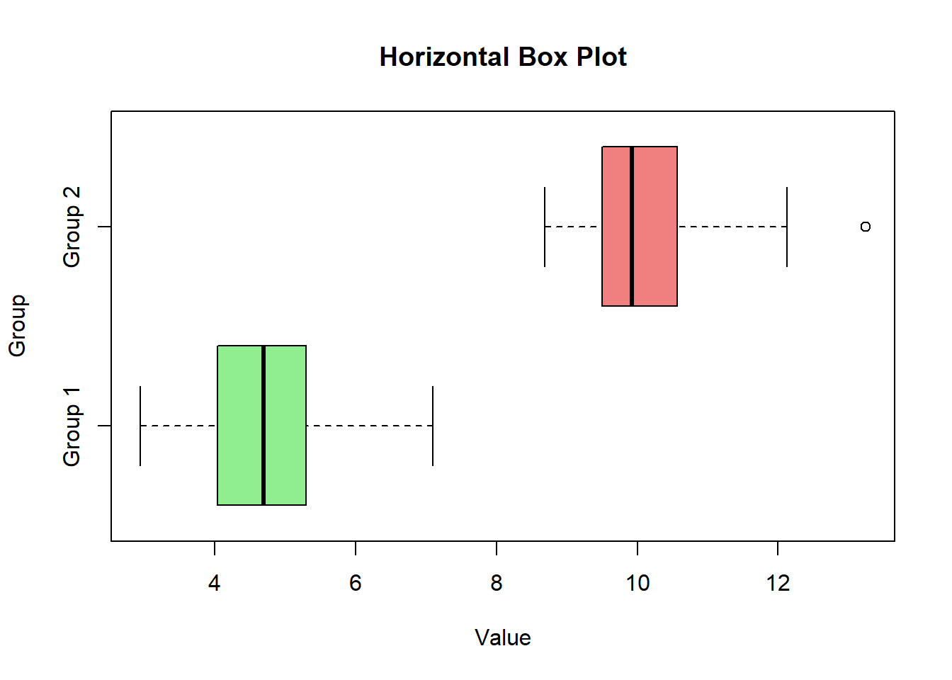
Adding titles, labels, and colors helps in understanding the context and meaning of the box plot.
# Creating a customized box plot with titles, labels, and colors

boxplot(value ~ group, data = data, main = "Customized Box Plot", xlab = "Group", ylab = "Value", col = c("lightgreen", "lightcoral"))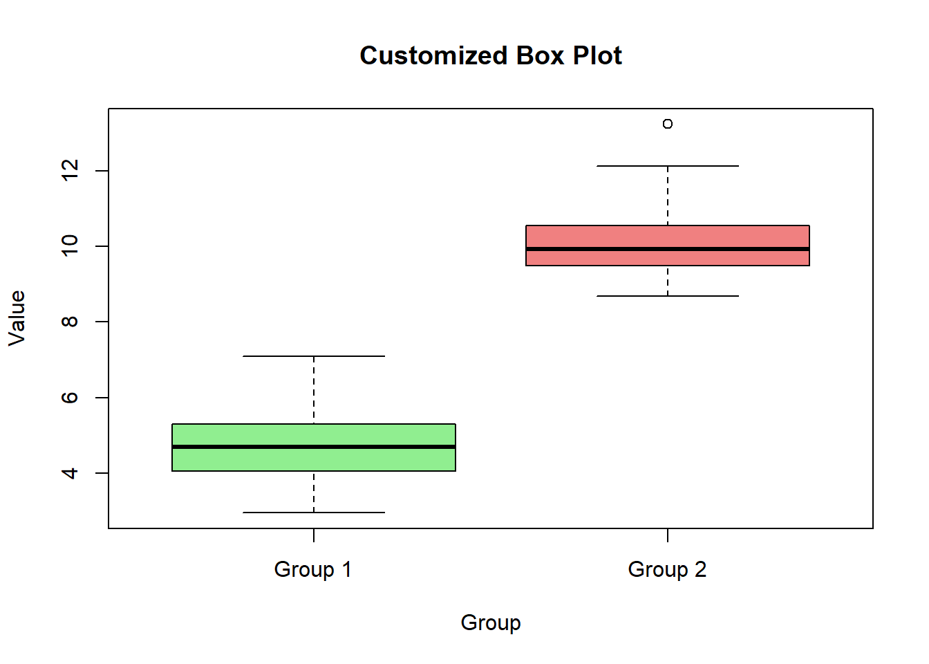
Here’s a comprehensive example of creating and customizing box plots in R.
# Creating sample data

set.seed(123)

data <- data.frame(

  value = c(rnorm(50, mean = 5), rnorm(50, mean = 10)),

  group = rep(c("Group 1", "Group 2"), each = 50)

)


# Basic box plot

boxplot(data$value, main = "Basic Box Plot", ylab = "Value", col = "lightblue")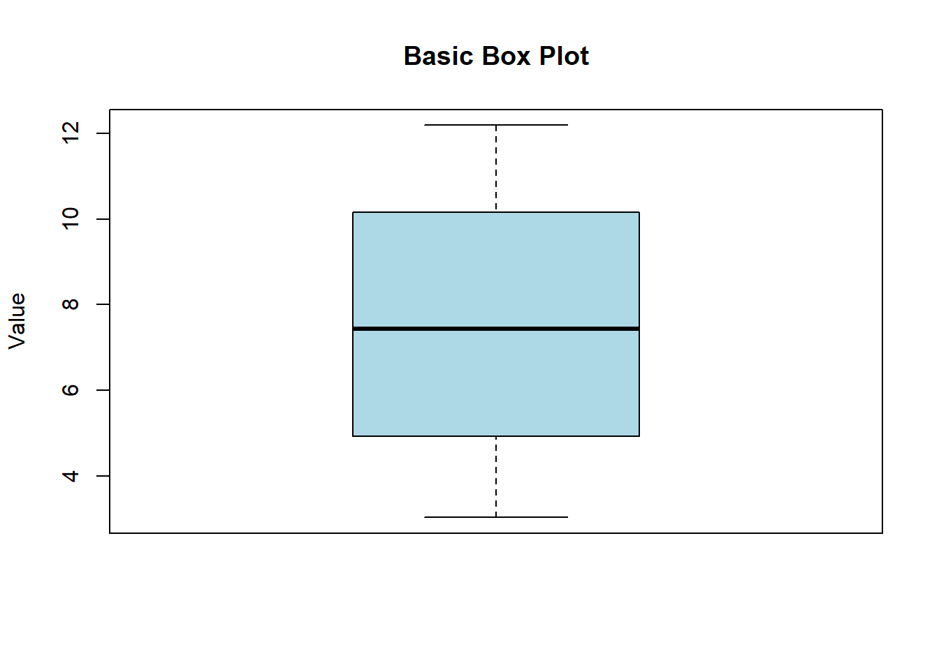
# Box plot for multiple groups

boxplot(value ~ group, data = data, main = "Box Plot for Multiple Groups", xlab = "Group", ylab = "Value", col = c("lightgreen", "lightcoral"))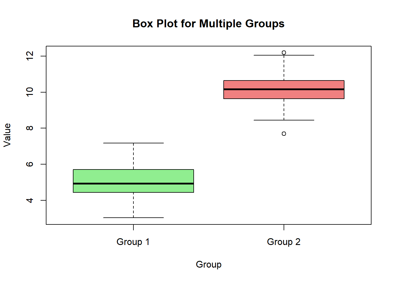
# Box plot with notches

boxplot(value ~ group, data = data, main = "Box Plot with Notches", xlab = "Group", ylab = "Value", col = c("lightgreen", "lightcoral"), notch = TRUE)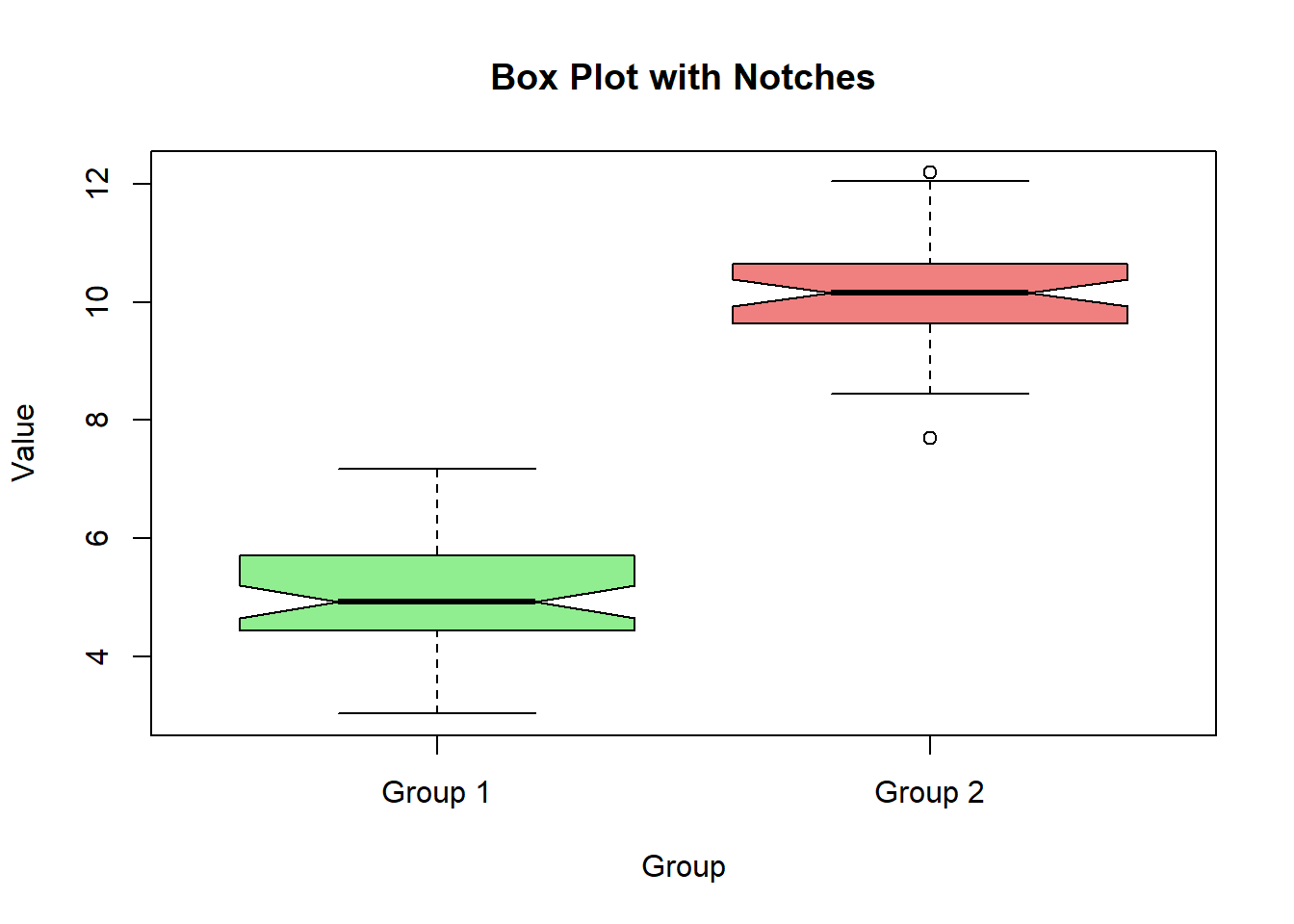
# Horizontal box plot

boxplot(value ~ group, data = data, main = "Horizontal Box Plot", xlab = "Value", ylab = "Group", col = c("lightgreen", "lightcoral"), horizontal = TRUE)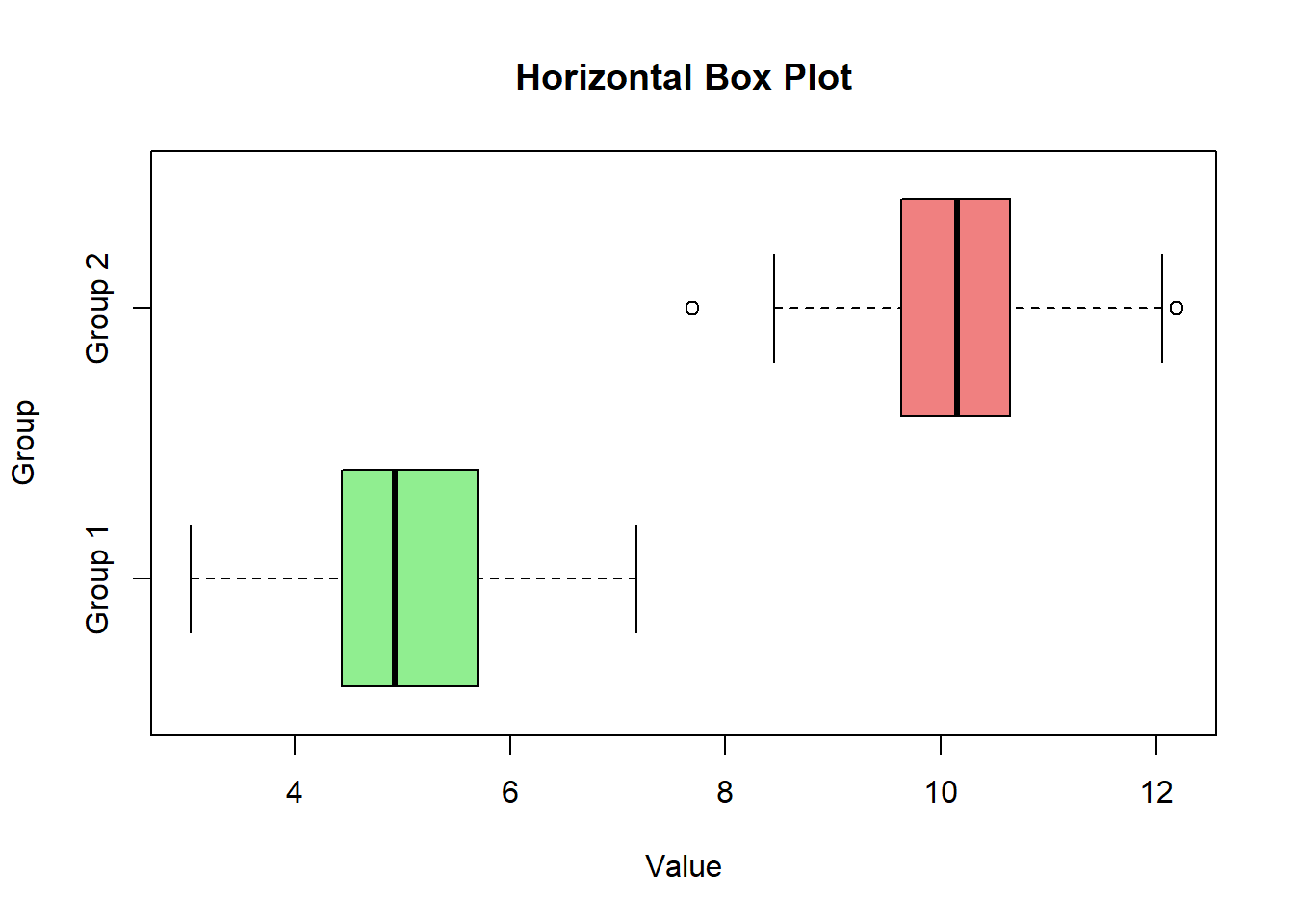
# Customized box plot

boxplot(value ~ group, data = data, main = "Customized Box Plot", xlab = "Group", ylab = "Value", col = c("lightgreen", "lightcoral"))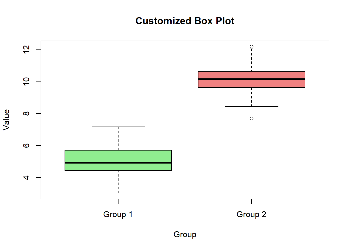
In this lecture, we covered how to create and customize box plots in R. We explored various techniques for creating box plots for single and multiple groups, adding notches, customizing colors, and adding titles and labels. Box plots are a powerful tool for visualizing the distribution of numerical data and identifying outliers.
For more detailed information, consider exploring the following resources:
If you found this lecture helpful, make sure to check out the other lectures in the R Graphs series. Happy plotting!