# Creating sample data

set.seed(123)

x <- rnorm(100)

y <- rnorm(100)


# Creating a scatter plot

plot(x, y, main = "Scatter Plot", xlab = "X Axis", ylab = "Y Axis", pch = 19, col = "blue")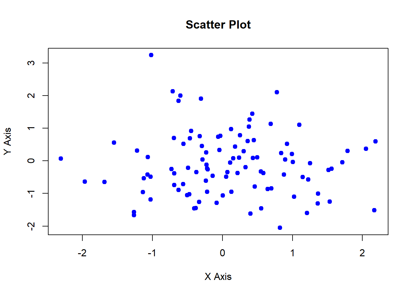
The base R plotting system provides a simple yet powerful set of tools for creating a wide range of plots. It is built into R and does not require additional packages, making it an essential tool for data visualization. In this lecture, we will explore how to create and customize plots using the base R plotting system.
The plot() function is the most versatile and commonly used function in the base R plotting system. It can create various types of plots depending on the input data.
Customizing plots involves adding titles, labels, legends, and changing colors, symbols, and line types.
Scatter Plot: Displays the relationship between two numerical variables.
Line Chart: Shows trends over time or ordered categories.
Bar Plot: Represents categorical data with rectangular bars.
Histogram: Visualizes the distribution of a numerical variable.
Box Plot: Summarizes the distribution of a numerical variable using five-number summary.
A scatter plot displays the relationship between two numerical variables.
# Creating sample data
set.seed(123)
x <- rnorm(100)
y <- rnorm(100)
# Creating a scatter plot
plot(x, y, main = "Scatter Plot", xlab = "X Axis", ylab = "Y Axis", pch = 19, col = "blue")
# Plot result

plot(x, y, main = "Scatter Plot", xlab = "X Axis", ylab = "Y Axis", pch = 19, col = "blue")
A line chart shows trends over time or ordered categories.
# Creating sample data

time <- 1:100

values <- cumsum(rnorm(100))


# Creating a line chart

plot(time, values, type = "l", main = "Line Chart", xlab = "Time", ylab = "Values", col = "red")
# Plot result

plot(time, values, type = "l", main = "Line Chart", xlab = "Time", ylab = "Values", col = "red")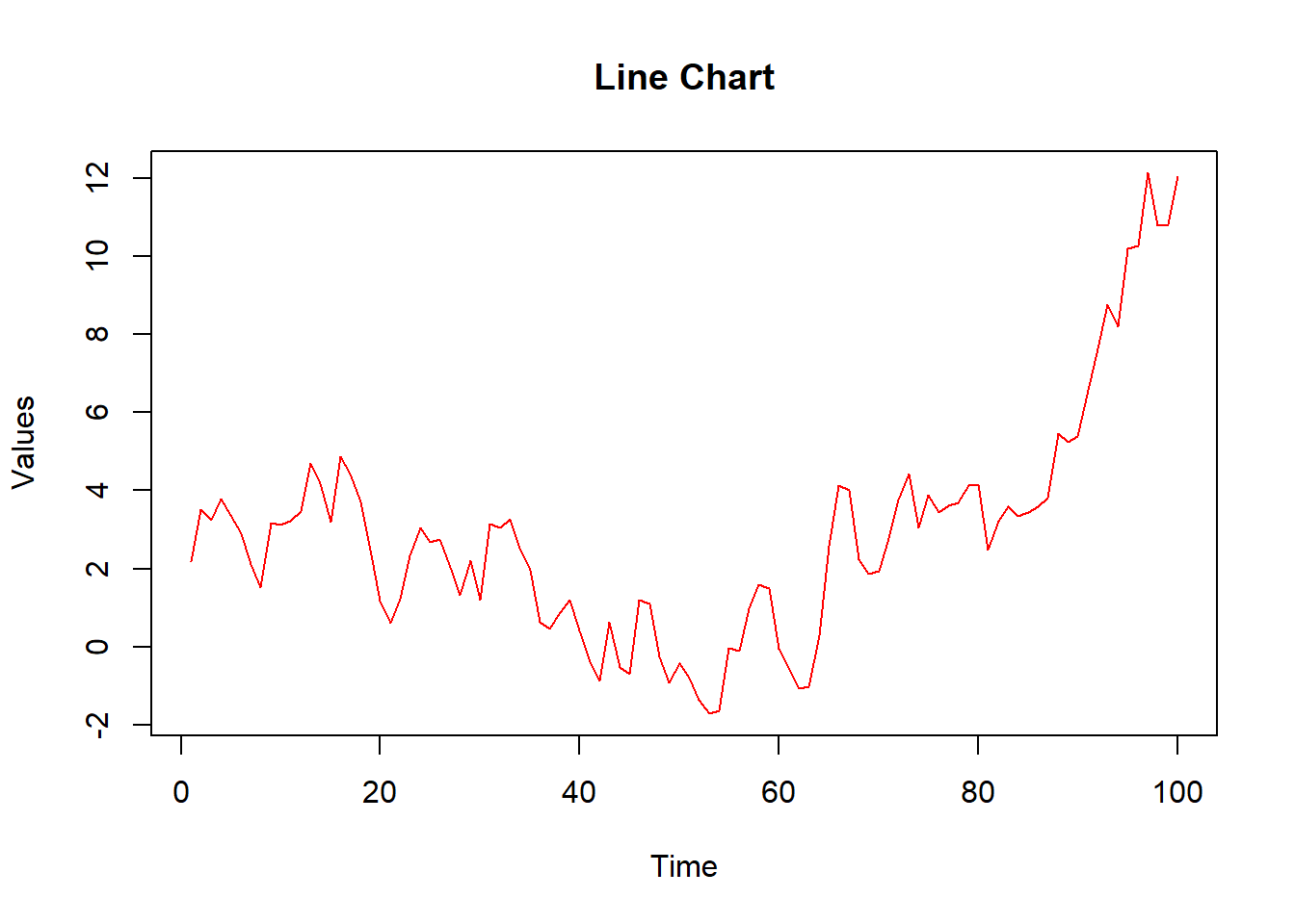
A bar plot represents categorical data with rectangular bars.
# Creating sample data

categories <- c("A", "B", "C", "D")

counts <- c(23, 45, 12, 56)


# Creating a bar plot

barplot(counts, names.arg = categories, main = "Bar Plot", xlab = "Category", ylab = "Count", col = "green")
# Plot result

barplot(counts, names.arg = categories, main = "Bar Plot", xlab = "Category", ylab = "Count", col = "green")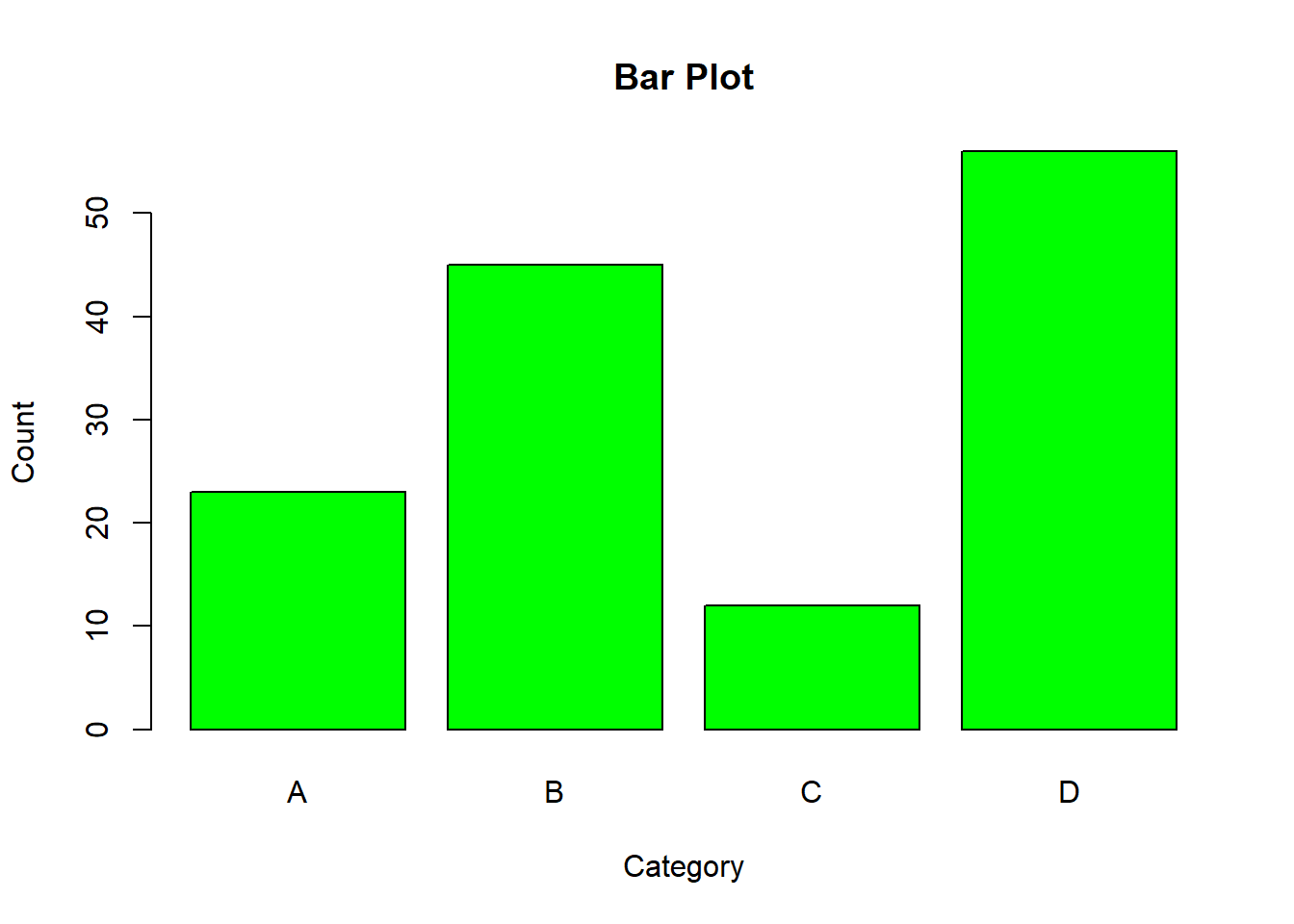
A histogram visualizes the distribution of a numerical variable.
# Creating sample data

data <- rnorm(1000)


# Creating a histogram

hist(data, main = "Histogram", xlab = "Value", ylab = "Frequency", col = "purple", breaks = 30)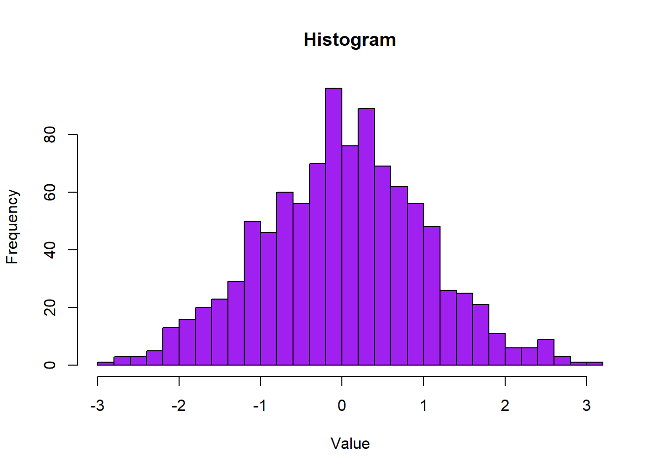
# Plot result

hist(data, main = "Histogram", xlab = "Value", ylab = "Frequency", col = "purple", breaks = 30)
A box plot summarizes the distribution of a numerical variable using the five-number summary.
# Creating sample data

data <- list(

  Group1 = rnorm(100, mean = 5),

  Group2 = rnorm(100, mean = 10),

  Group3 = rnorm(100, mean = 15)

)


# Creating a box plot

boxplot(data, main = "Box Plot", xlab = "Group", ylab = "Value", col = c("orange", "yellow", "cyan"))
# Plot result

boxplot(data, main = "Box Plot", xlab = "Group", ylab = "Value", col = c("orange", "yellow", "cyan"))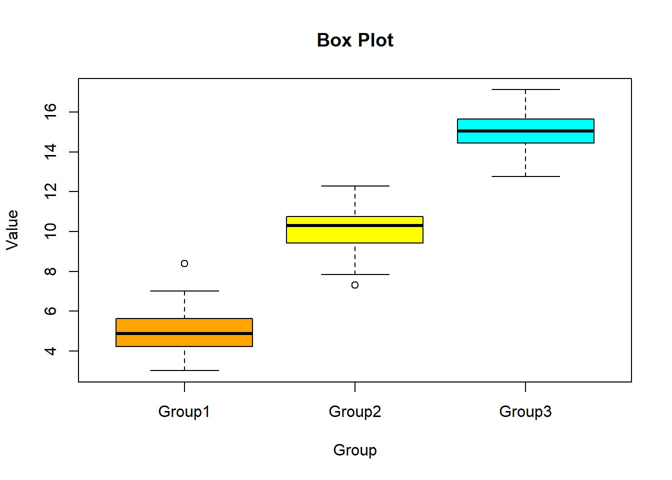
Adding titles and labels helps in understanding the context and meaning of the plot.
# Creating a scatter plot with title and labels

plot(x, y, main = "Scatter Plot with Title and Labels", xlab = "X Axis Label", ylab = "Y Axis Label", pch = 19, col = "blue")
# Plot result
plot(x, y, main = "Scatter Plot with Title and Labels", xlab = "X Axis Label", ylab = "Y Axis Label", pch = 19, col = "blue")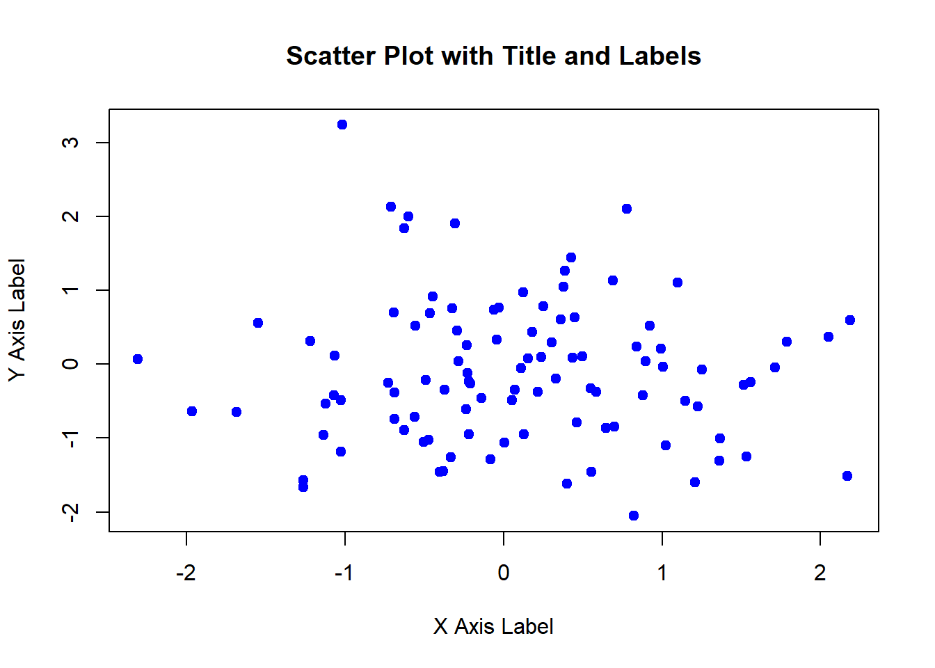
Legends help in distinguishing different groups or categories in the plot.
# Creating sample data

group1 <- rnorm(100, mean = 5)

group2 <- rnorm(100, mean = 10)


# Creating a scatter plot with legend

plot(group1, col = "red", pch = 19, main = "Scatter Plot with Legend", xlab = "X Axis", ylab = "Y Axis")

points(group2, col = "blue", pch = 19)

legend("topleft", legend = c("Group 1", "Group 2"), col = c("red", "blue"), pch = 19)
# Plot result

plot(group1, col = "red", pch = 19, main = "Scatter Plot with Legend", xlab = "X Axis", ylab = "Y Axis")

points(group2, col = "blue", pch = 19)

legend("topleft", legend = c("Group 1", "Group 2"), col = c("red", "blue"), pch = 19)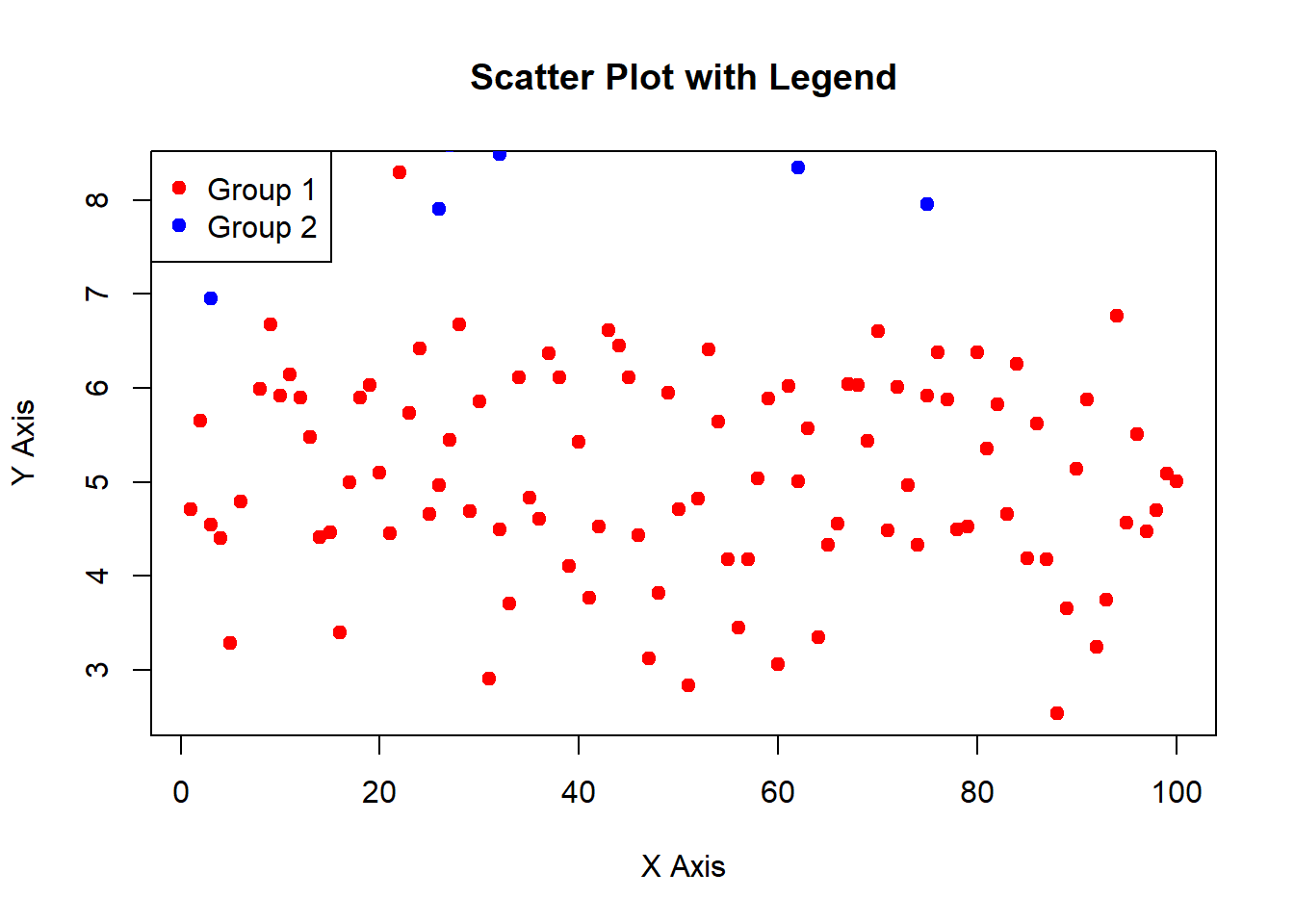
In this lecture, we covered how to create and customize plots using the base R plotting system. We explored various plot types, including scatter plots, line charts, bar plots, histograms, and box plots. We also learned how to add titles, labels, and legends to enhance the readability and interpretability of the plots.
For more detailed information, consider exploring the following resources:
If you found this lecture helpful, make sure to check out the other lectures in the R Graphs series. Happy plotting!