# Creating sample data

x <- rnorm(100)

y <- rnorm(100)


# Adding titles and labels

plot(x, y, main = "Scatter Plot with Titles and Labels", xlab = "X Axis Label", ylab = "Y Axis Label", pch = 19, col = "blue")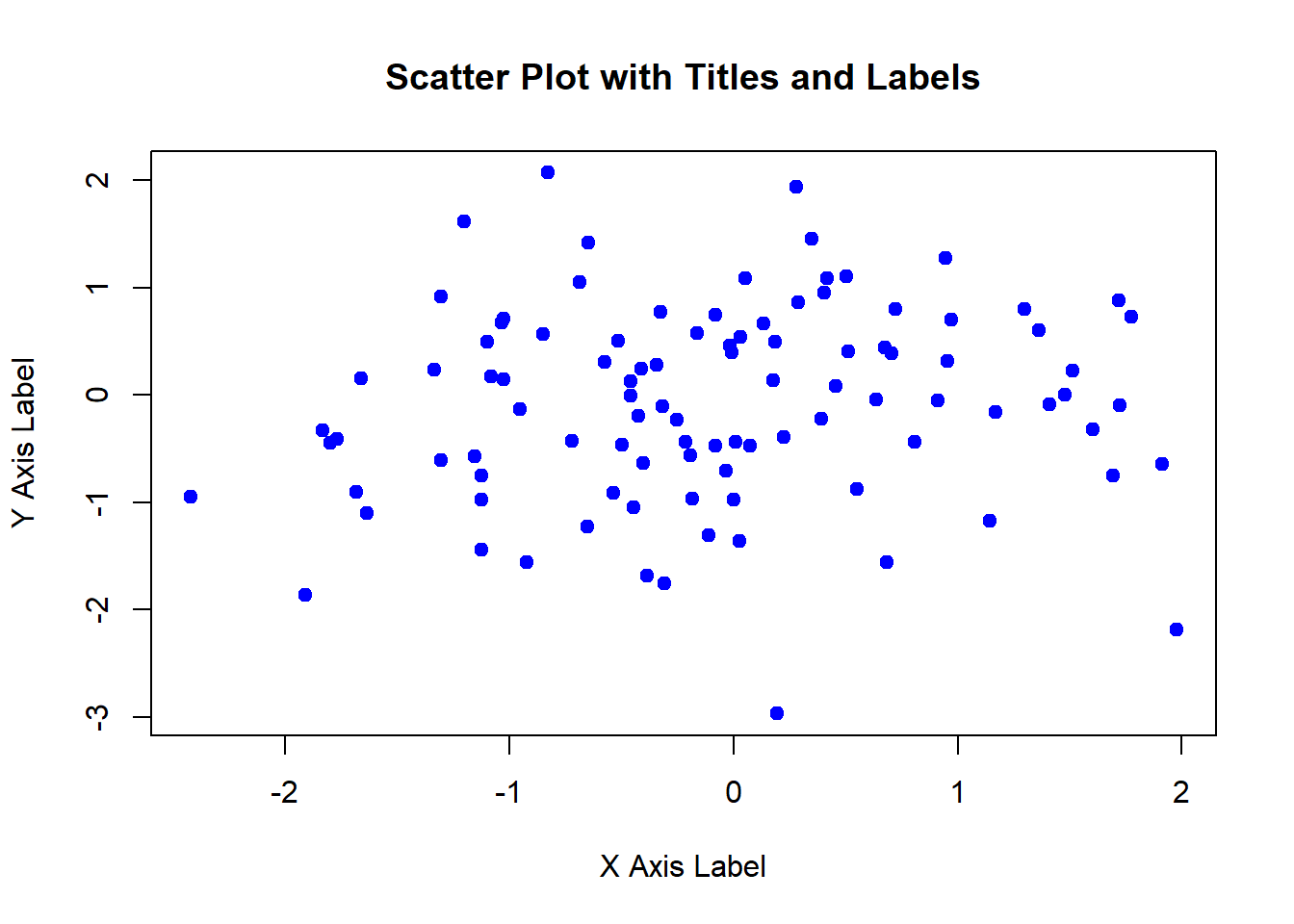
Customizing plots is essential for enhancing their appearance and readability. R provides a wide range of options for customizing plots, including adding titles, labels, legends, colors, and annotations. In this lecture, we will learn various techniques for customizing plots in R.
Adding titles and labels helps in understanding the context and meaning of the plot.
Customizing colors and symbols can differentiate between groups or highlight specific data points.
Adding legends helps in identifying the categories or groups in the plot.
Adding gridlines can make it easier to read the values of the data points.
Adding annotations can provide additional information about specific data points or regions in the plot.
You can add titles and labels to a plot using the main, xlab, and ylab parameters in the plot() function.
# Creating sample data
x <- rnorm(100)
y <- rnorm(100)
# Adding titles and labels
plot(x, y, main = "Scatter Plot with Titles and Labels", xlab = "X Axis Label", ylab = "Y Axis Label", pch = 19, col = "blue")
You can customize colors and symbols using the col and pch parameters in the plot() function.
# Creating sample data with groups

group <- sample(c("Group 1", "Group 2"), 100, replace = TRUE)
color_map <- c("Group 1" = "blue", "Group 2" = "red")


# Customizing colors and symbols

plot(x, y,
     main = "Scatter Plot with Custom Colors and Symbols",
     xlab = "X Axis",
     ylab = "Y Axis",
     pch = as.numeric(factor(group)),  # Convert groups to numbers
     col = color_map[group])  # Map colors to groups


legend("topright",
       legend = c("Group 1", "Group 2"),
       pch = c(1, 2),
       col = c("black", "red"))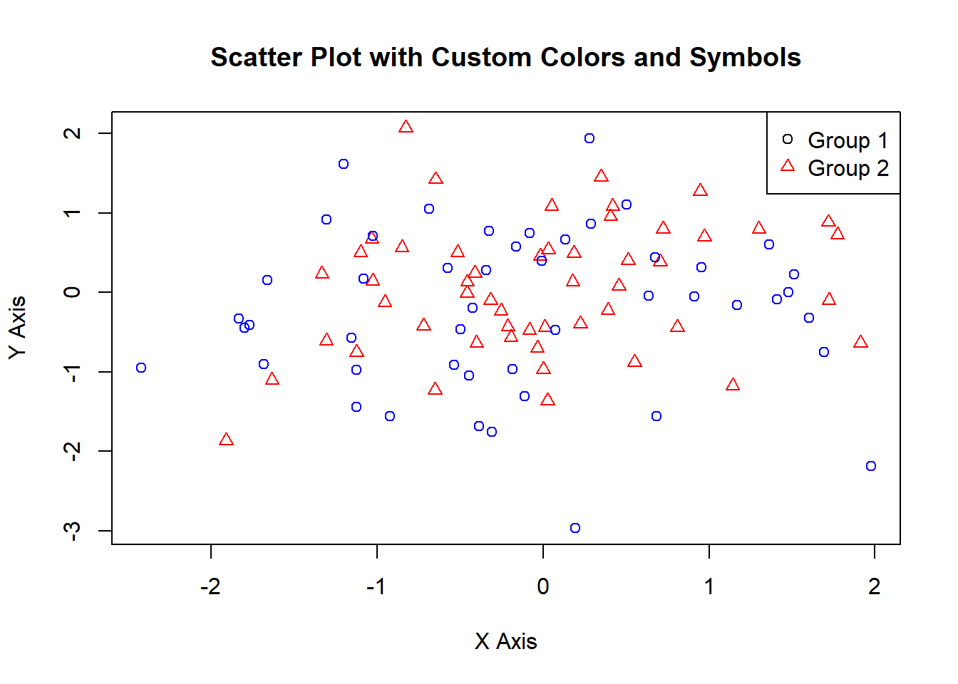
You can add legends to a plot using the legend() function.
# Creating sample data with groups

group <- sample(c("Group 1", "Group 2"), 100, replace = TRUE)
color_map <- c("Group 1" = "blue", "Group 2" = "red")


# Adding legends

plot(x, y,
     main = "Scatter Plot with Legends",
     xlab = "X Axis",
     ylab = "Y Axis",
     pch = as.numeric(factor(group)),  # Convert groups to numbers
     col = color_map[group])  # Map colors to groups

legend("topright",
       legend = c("Group 1", "Group 2"),
       pch = c(1, 2),
       col = c("black", "red"))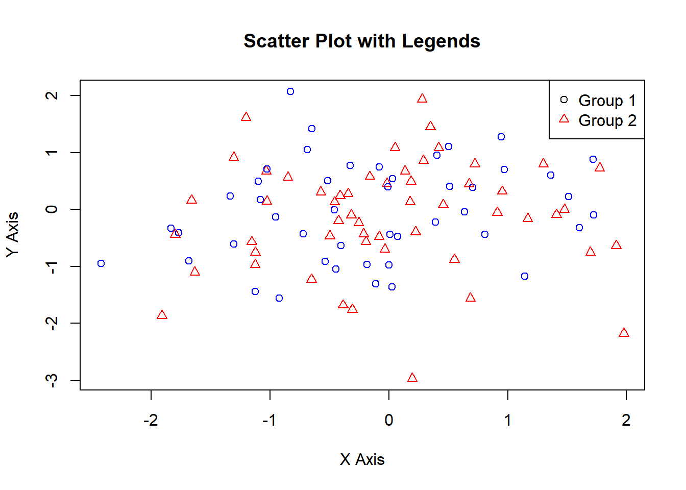
You can add gridlines to a plot using the grid() function.
# Adding gridlines

plot(x, y, main = "Scatter Plot with Gridlines", xlab = "X Axis", ylab = "Y Axis", pch = 19, col = "blue")

grid(nx = NULL, ny = NULL, col = "lightgray", lty = "dotted")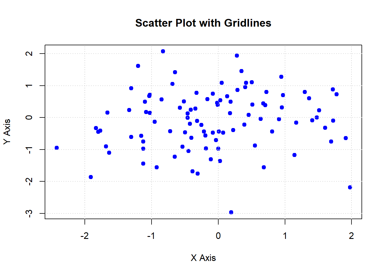
You can add annotations to a plot using the text() and arrows() functions.
# Adding annotations

plot(x, y, main = "Scatter Plot with Annotations", xlab = "X Axis", ylab = "Y Axis", pch = 19, col = "blue")

text(x[1:5], y[1:5], labels = paste("Point", 1:5), pos = 4)

arrows(x[1:5], y[1:5], x[1:5] + 0.5, y[1:5] + 0.5, length = 0.1, angle = 20, col = "red")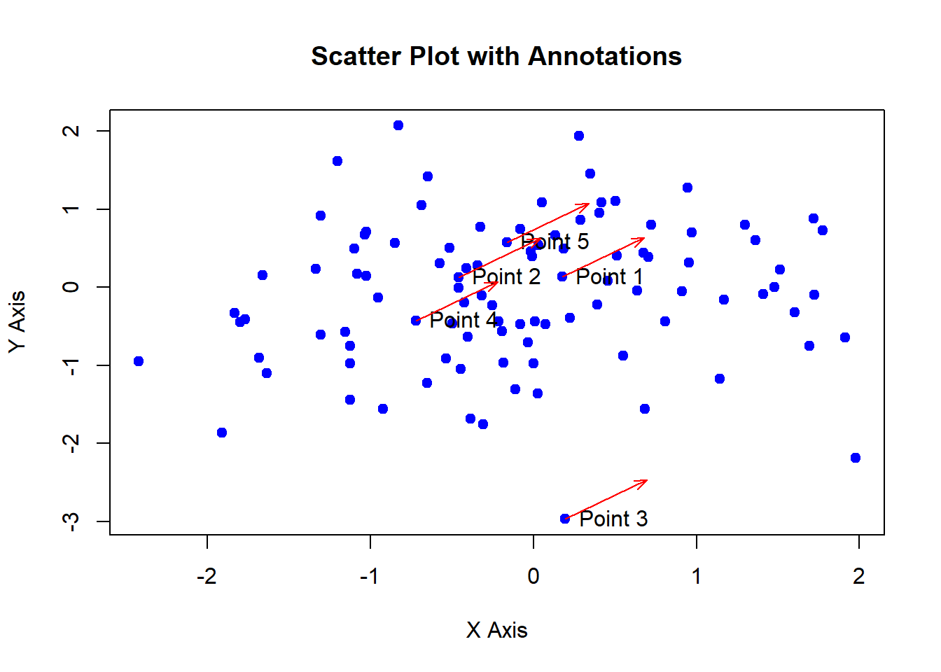
Here’s a comprehensive example of customizing plots in R.
# Creating sample data

x <- rnorm(100)

y <- rnorm(100)

group <- sample(c("Group 1", "Group 2"), 100, replace = TRUE)

# Create a color map
color_map <- c("Group 1" = "black", "Group 2" = "red")


# Adding titles and labels

plot(x, y,
     main = "Comprehensive Plot Customization",
     xlab = "X Axis",
     ylab = "Y Axis",
     pch = as.numeric(factor(group)),  # Convert groups to numbers for point shapes
     col = color_map[group])  # Map colors to groups


# Adding legends

legend("topright",
       legend = c("Group 1", "Group 2"),
       pch = c(1, 2),
       col = c("black", "red"))


# Adding gridlines

grid(nx = NULL, ny = NULL, col = "lightgray", lty = "dotted")


# Adding annotations

text(x[1:5], y[1:5], labels = paste("Point", 1:5), pos = 4)

arrows(x[1:5], y[1:5], x[1:5] + 0.5, y[1:5] + 0.5, length = 0.1, angle = 20, col = "red")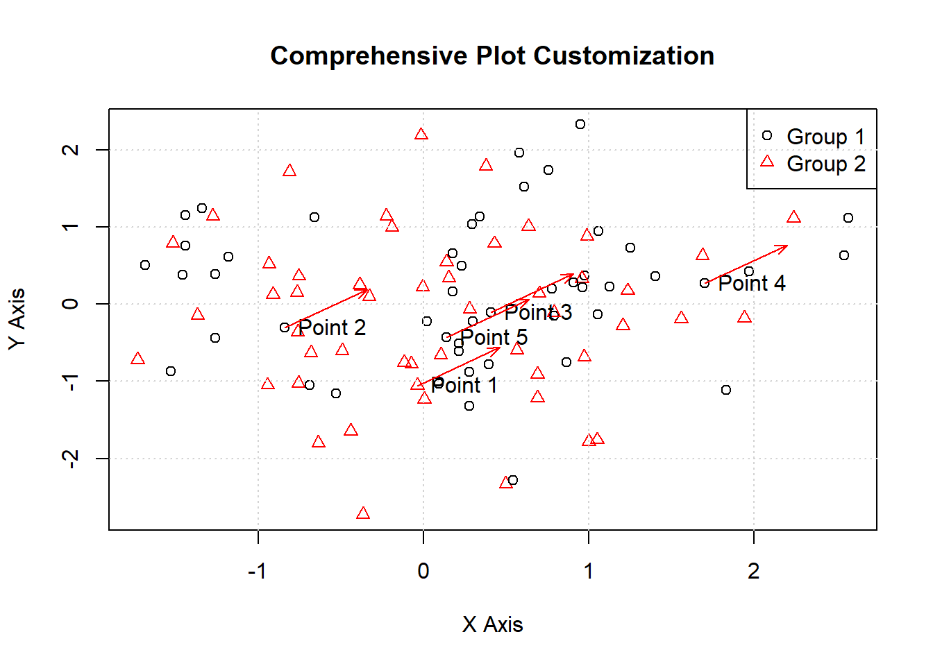
In this lecture, we covered how to customize plots in R. We explored various techniques for adding titles, labels, colors, symbols, legends, gridlines, and annotations. Customizing plots is essential for enhancing their appearance and readability, making them more effective for communicating insights.
For more detailed information, consider exploring the following resources:
If you found this lecture helpful, make sure to check out the other lectures in the R Graphs series. Happy plotting!